Was — 1992 to 2026
Polite. Quiet. A little beige.
Warm honesty and rosy windmills. Established and rooted. Whispers "we've been here." It's our legacy.
Blenz started with coffee. Thirty years later, we're showing up for every drink — matcha, cold brew, blue lattes, brizas, chillos, and whatever comes next. Same roots. New visual energy. No longer simply "coffee-first"; this brand refresh reflects our bold direction. We are old friends with a new style. A flexible store that shifts throughout the day. Coffee in the morning, variety at night. Be yourself at Blenz.
We are breaking with formality. BLENZ is now blenz. Scaled back, down to earth. We are a handshake and a hug, not a contract and a signature. More "come hang with us", less "come do your homework here". Less "grab and go coffee" and more "what are you doing after work?" vibe.
Built to be held. Crafted to be photographed. Designed to feed your soul. Equipped to hit what you crave. Wake up with a latte. Energize mid-day with a chillo. Hang out late at night with a briza. Every craving, designed and crafted for you. By you. Be you.
Warm honesty and rosy windmills. Established and rooted. Whispers "we've been here." It's our legacy.
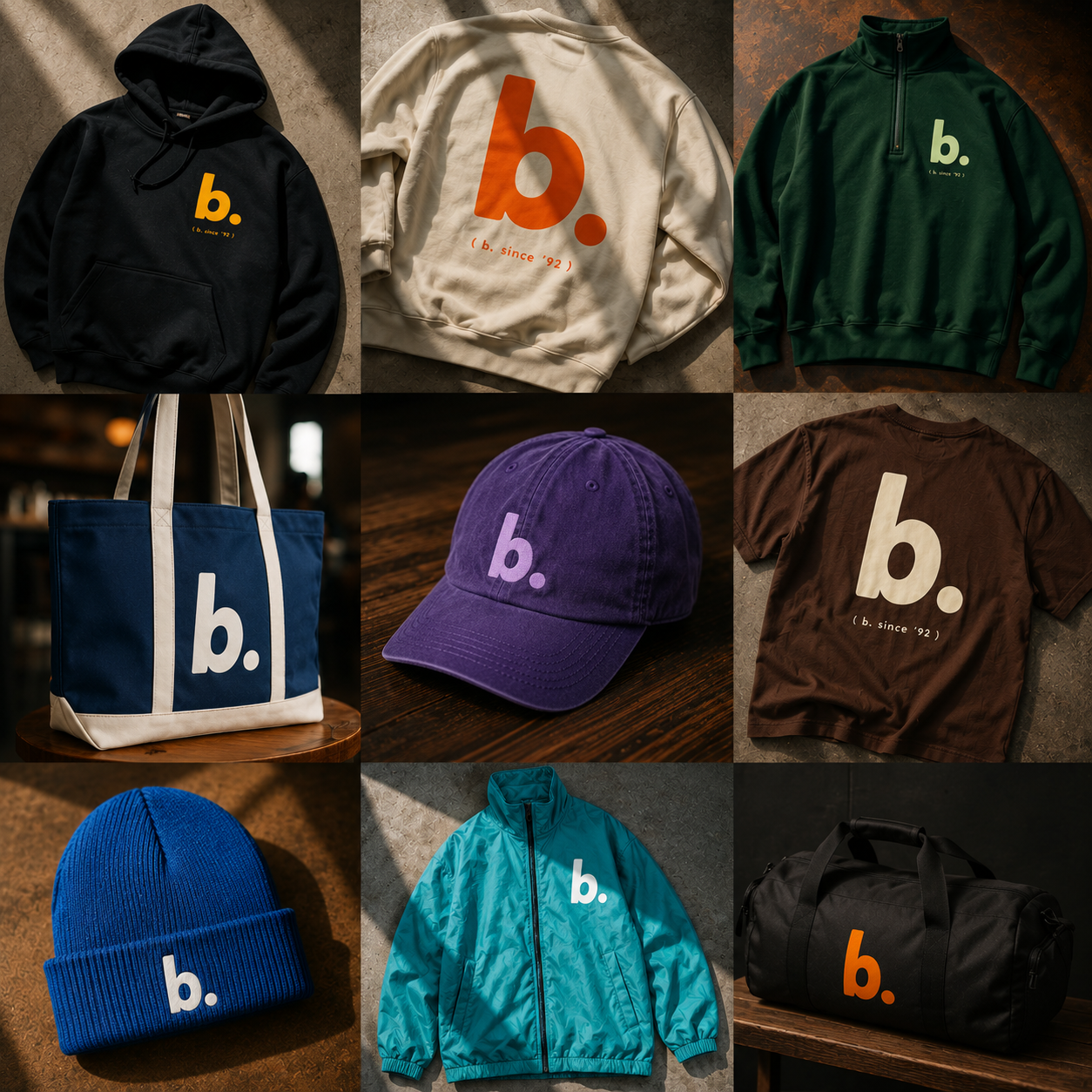
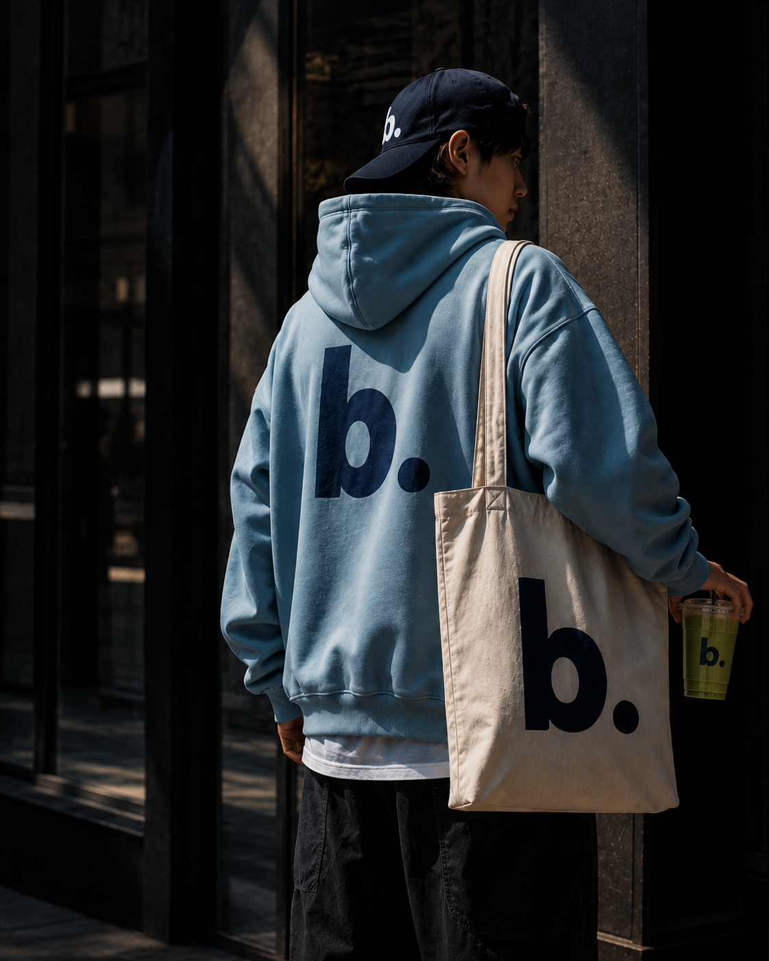
A bolder yellow that pops. We are lowercase and feel like a friend. You have found your tribe. The b. is not a sign — it's the mascot you want on your jacket.
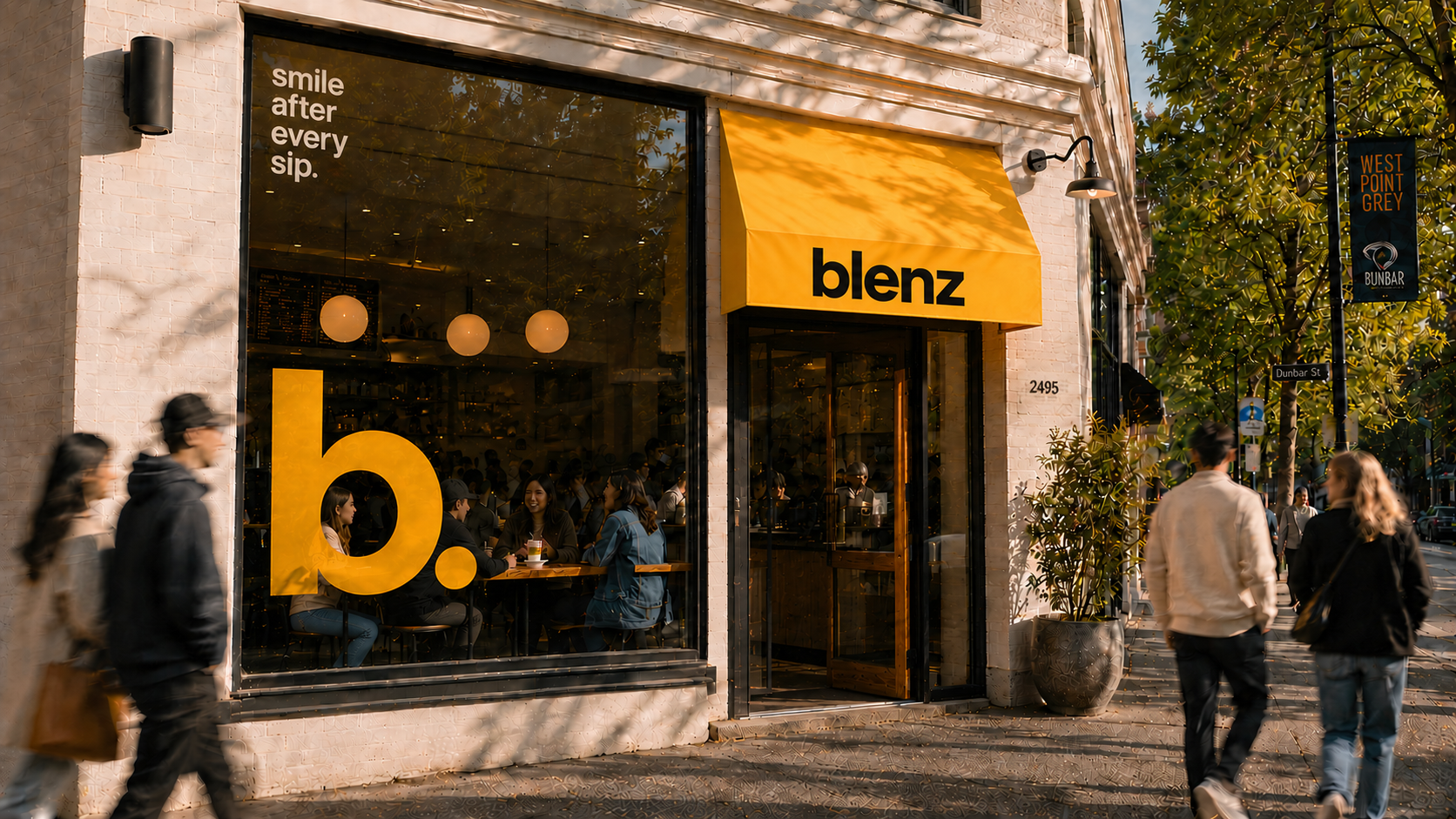
A brand built for real moments, golden hour and candid — slightly imperfect. This is how blenz looks and feels now.
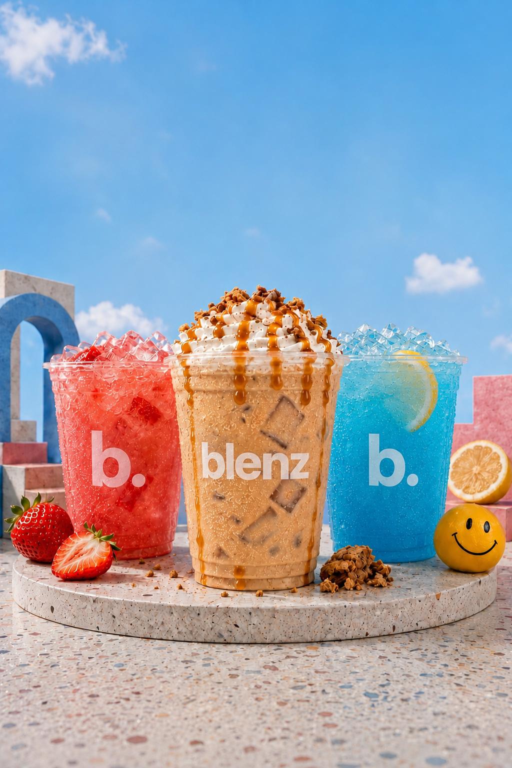
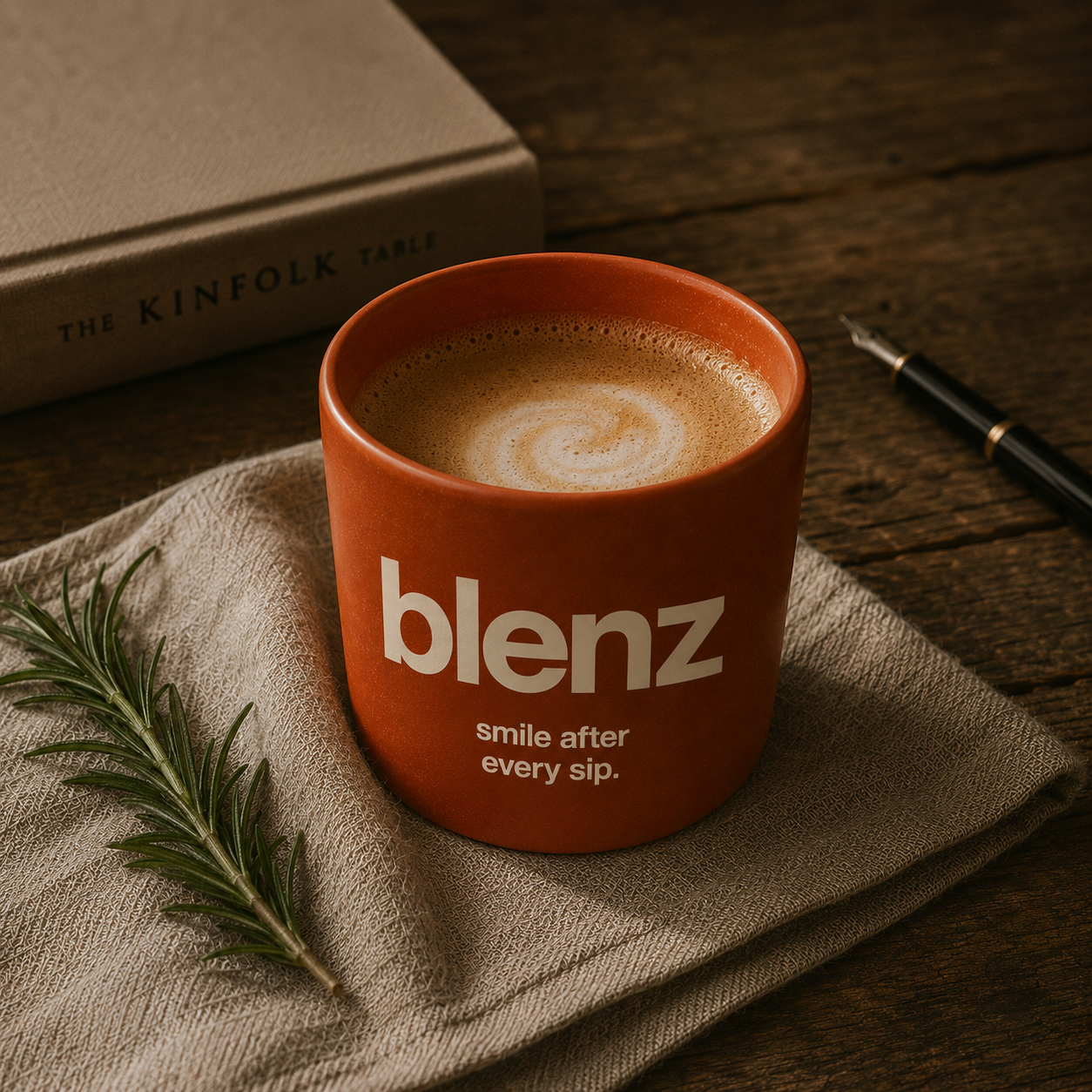
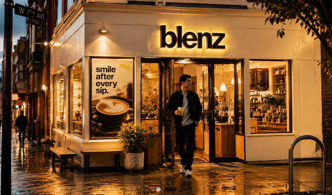
A confident lowercase blenz. A new flagship. BLENZ was the past, b. and blenz are the future.



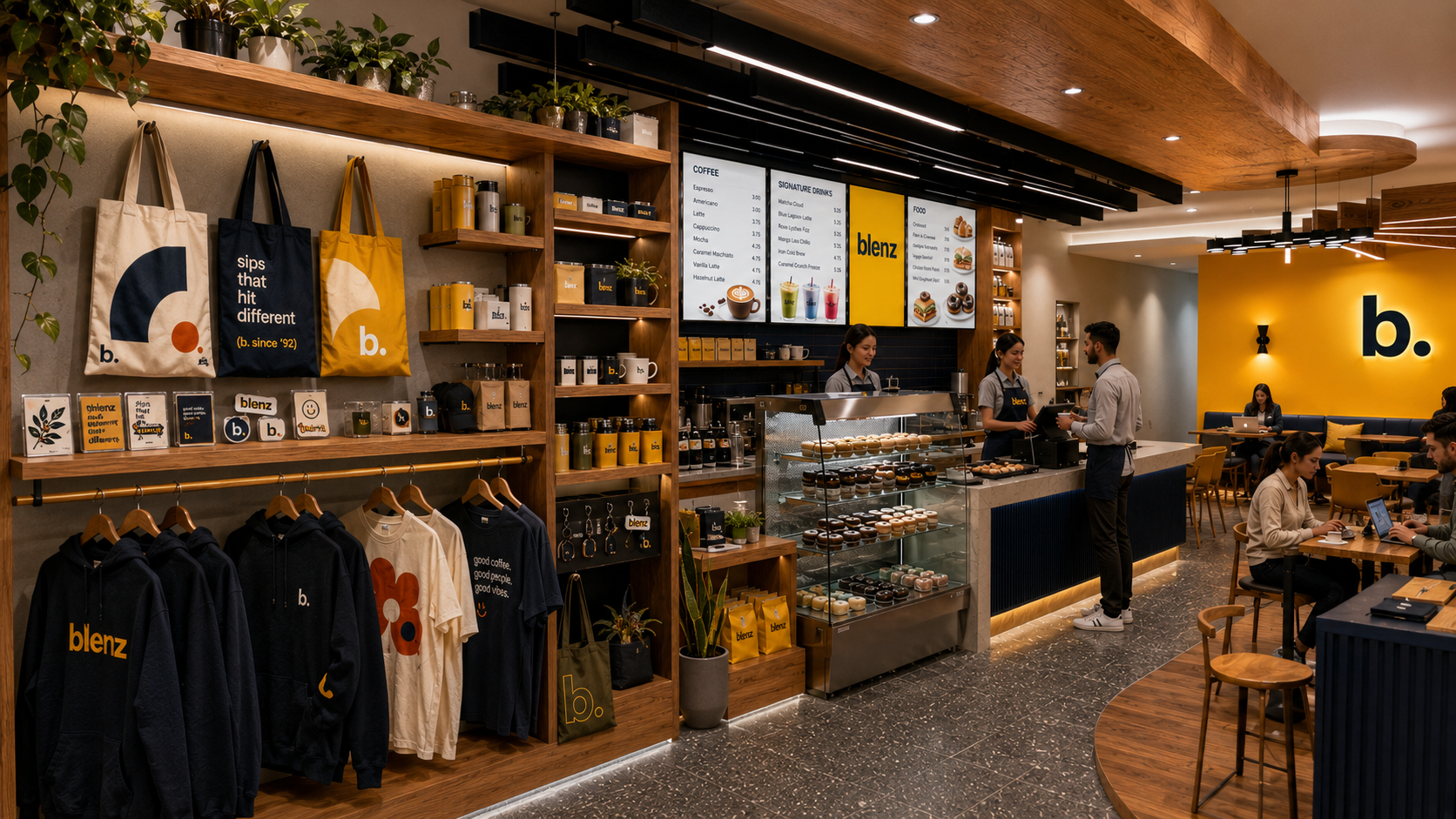
Confirmed interior direction — yellow, navy, wood, and the b. in the room. People in the frame. blenz on the cups, the aprons, the wall. This is what landlords and franchise partners walk into.
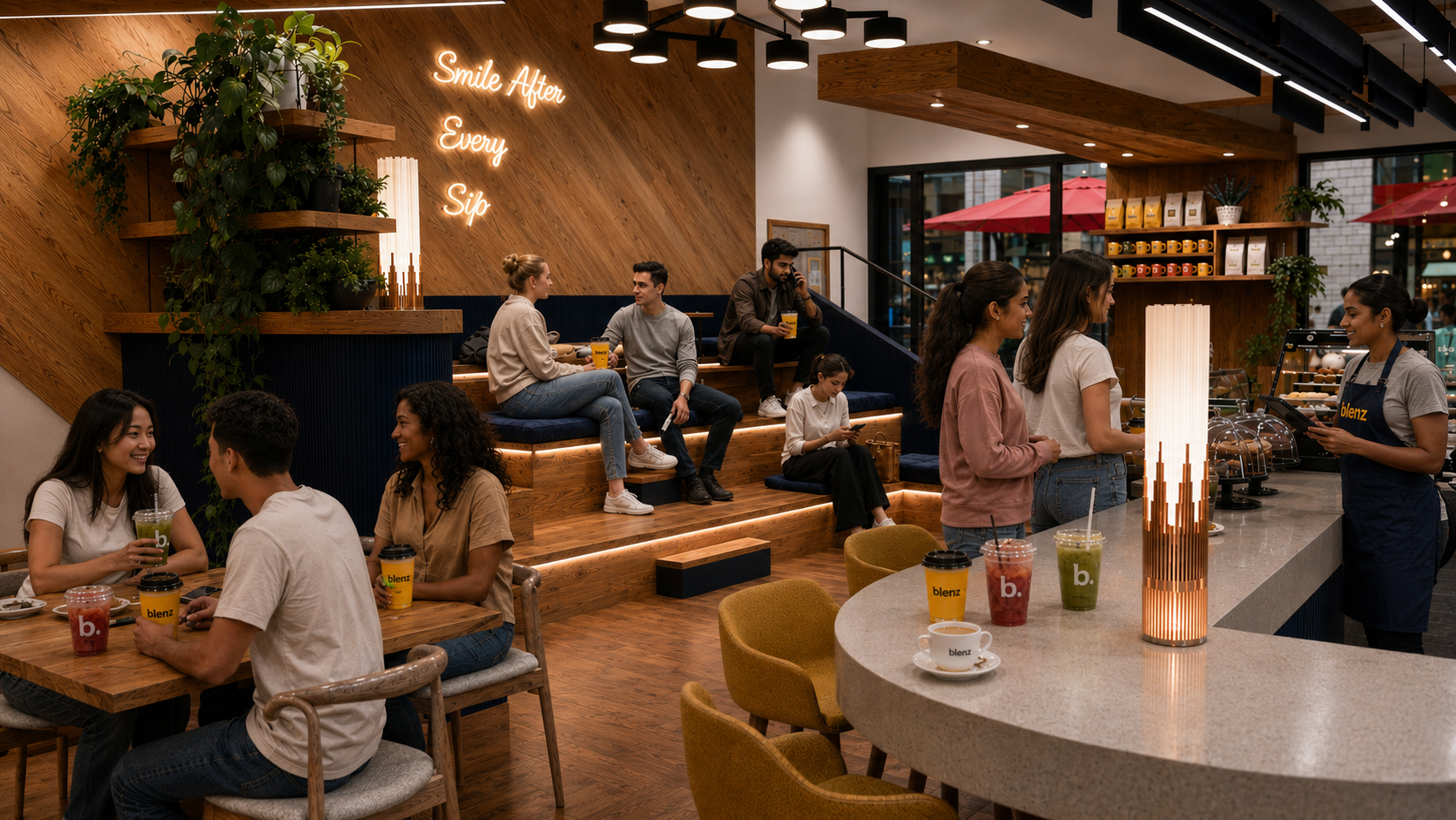 View B · Social seating
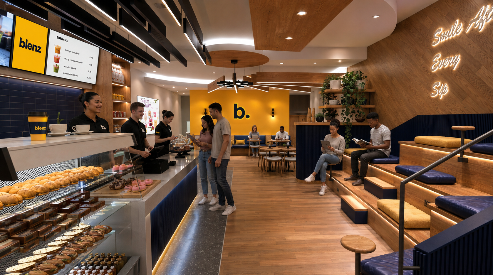 View C · Through the room
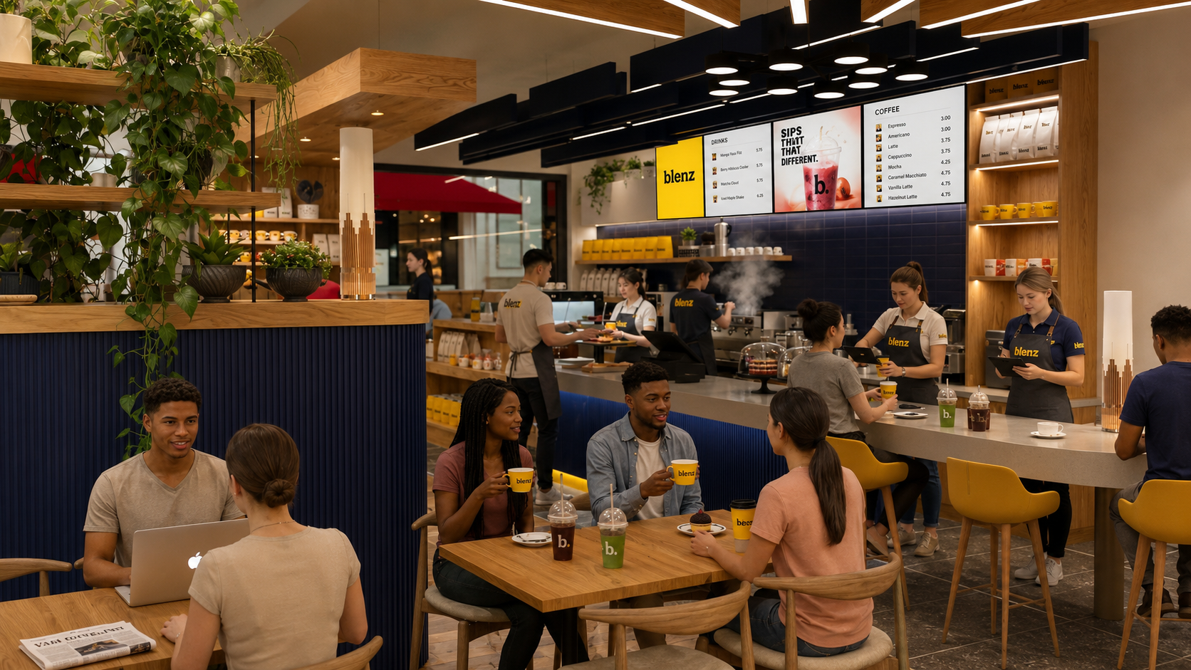 View D · Guest floor
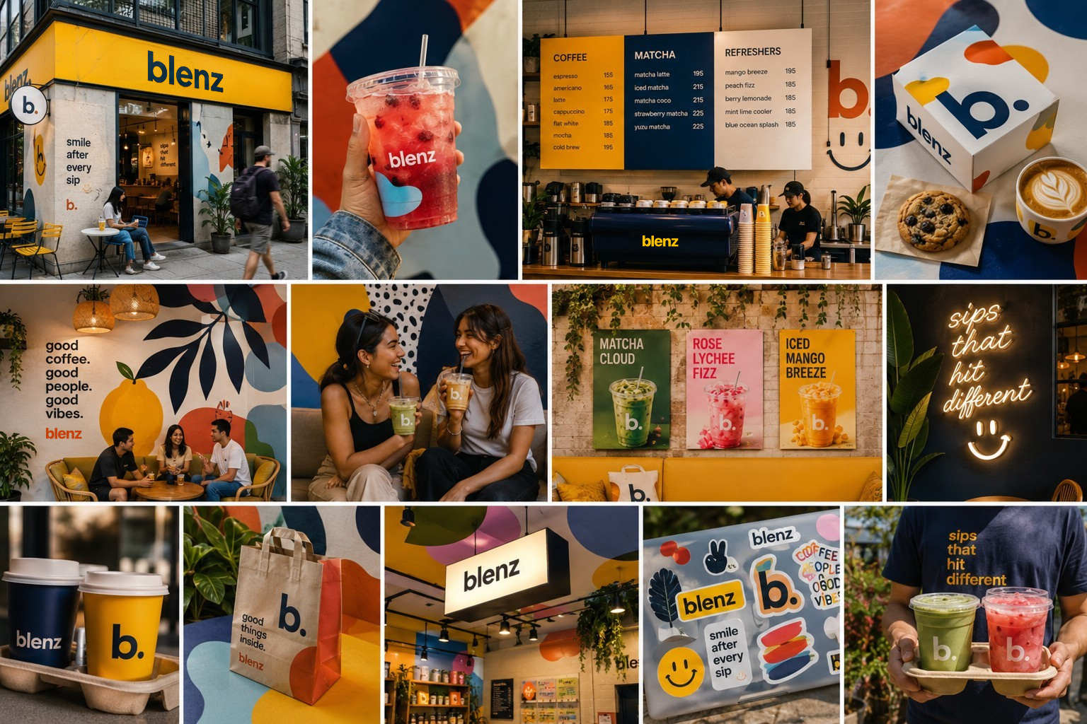 04.5 · Store lookbook 4
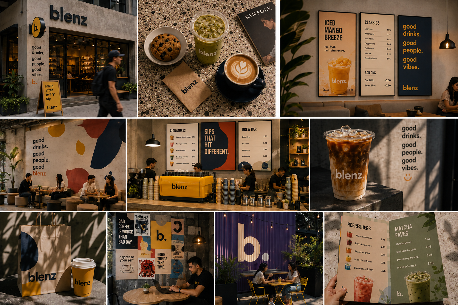 04.5 · Store lookbook 1
Blenz isn't trying to be cool. It's trying to be the spot you actually go to. The four principles below are how we behave on a cup, in a caption, on a sign, and at the till.
A regular's "good morning/good afternoon/good evening," not a server's script. We use names. We ask the small questions.
Confident colour and type. No exclamation marks. The drink is the headline; the welcome is the wow.
Heritage. Roots. History. Subtlety honors our roots, even when the brand travels to Toronto, Singapore, Dubai.
Real ingredients. Real latte art. Real people behind the bar. Visibly human, deliberately handmade.
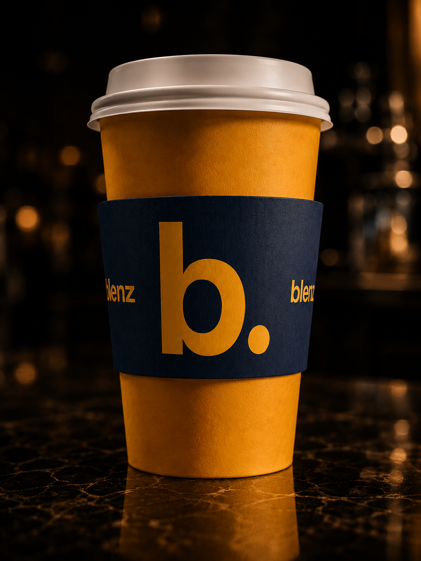
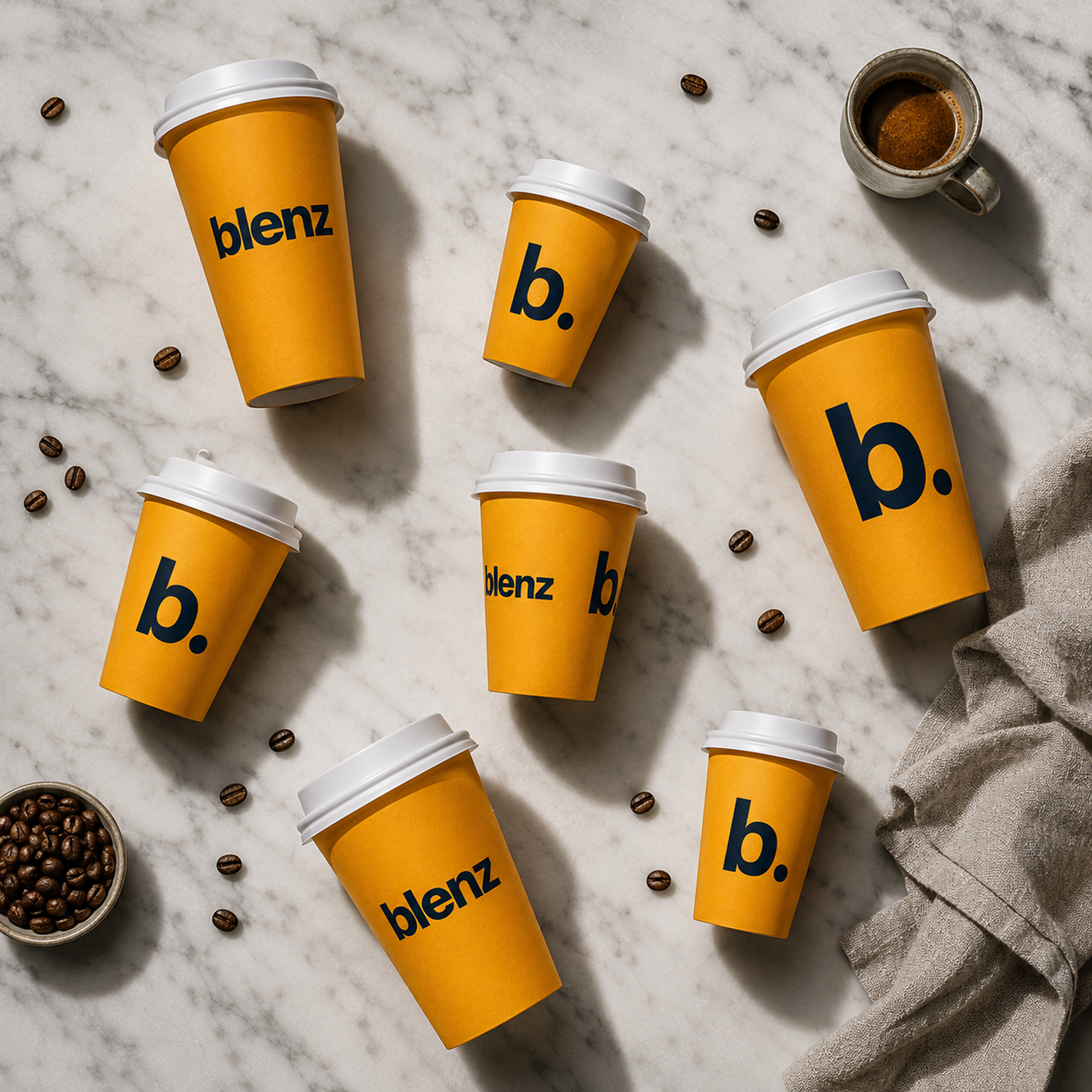
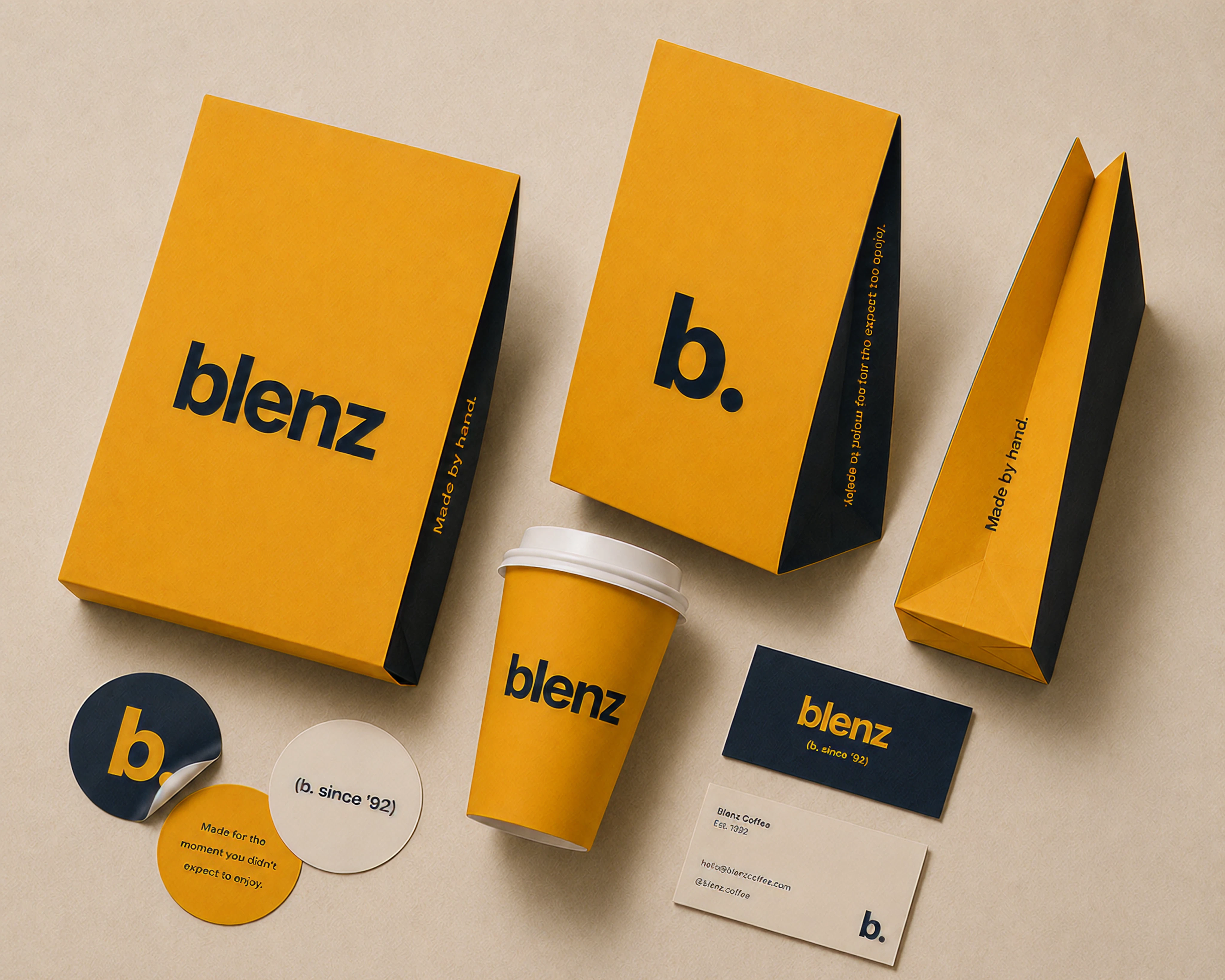
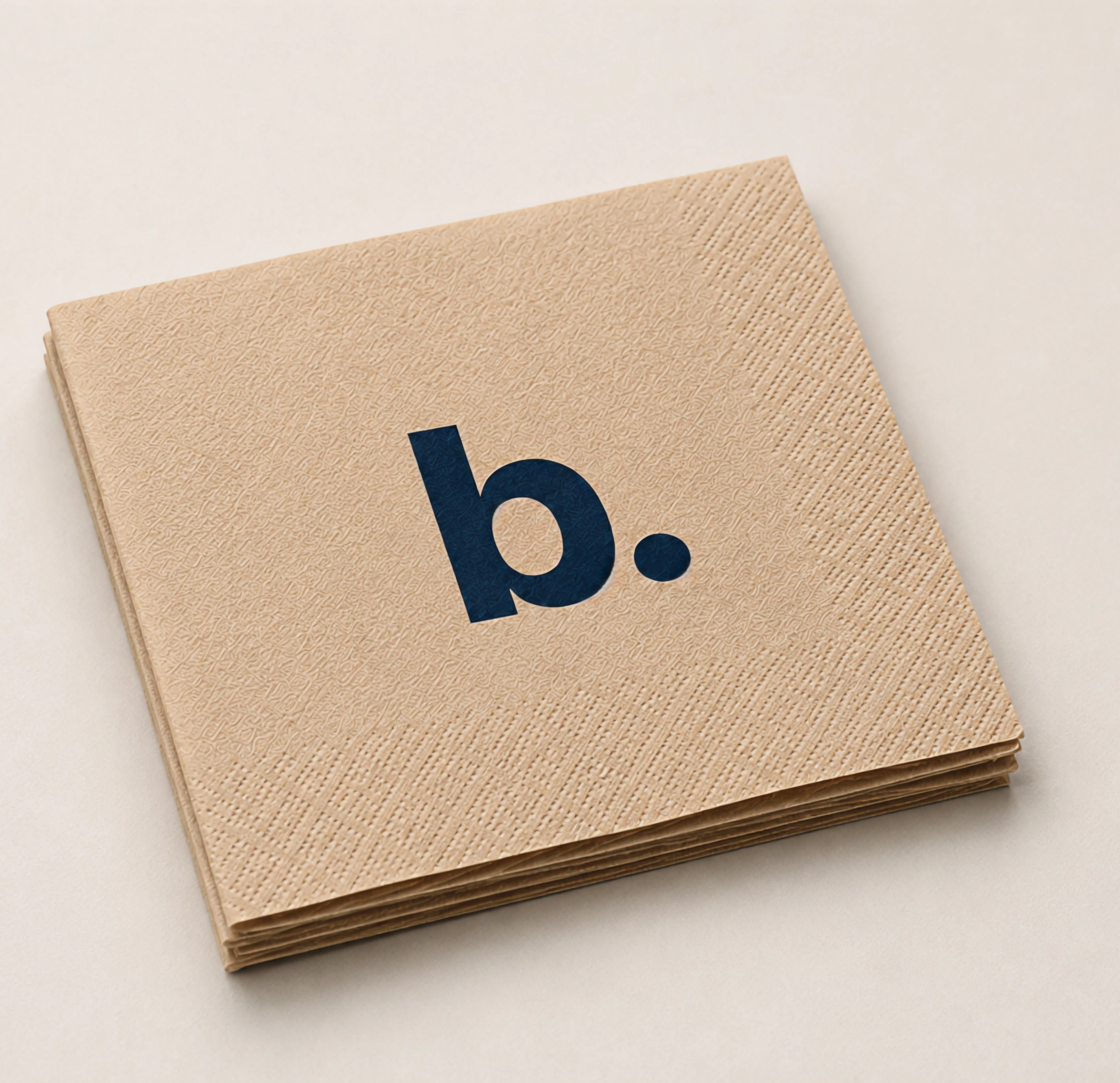
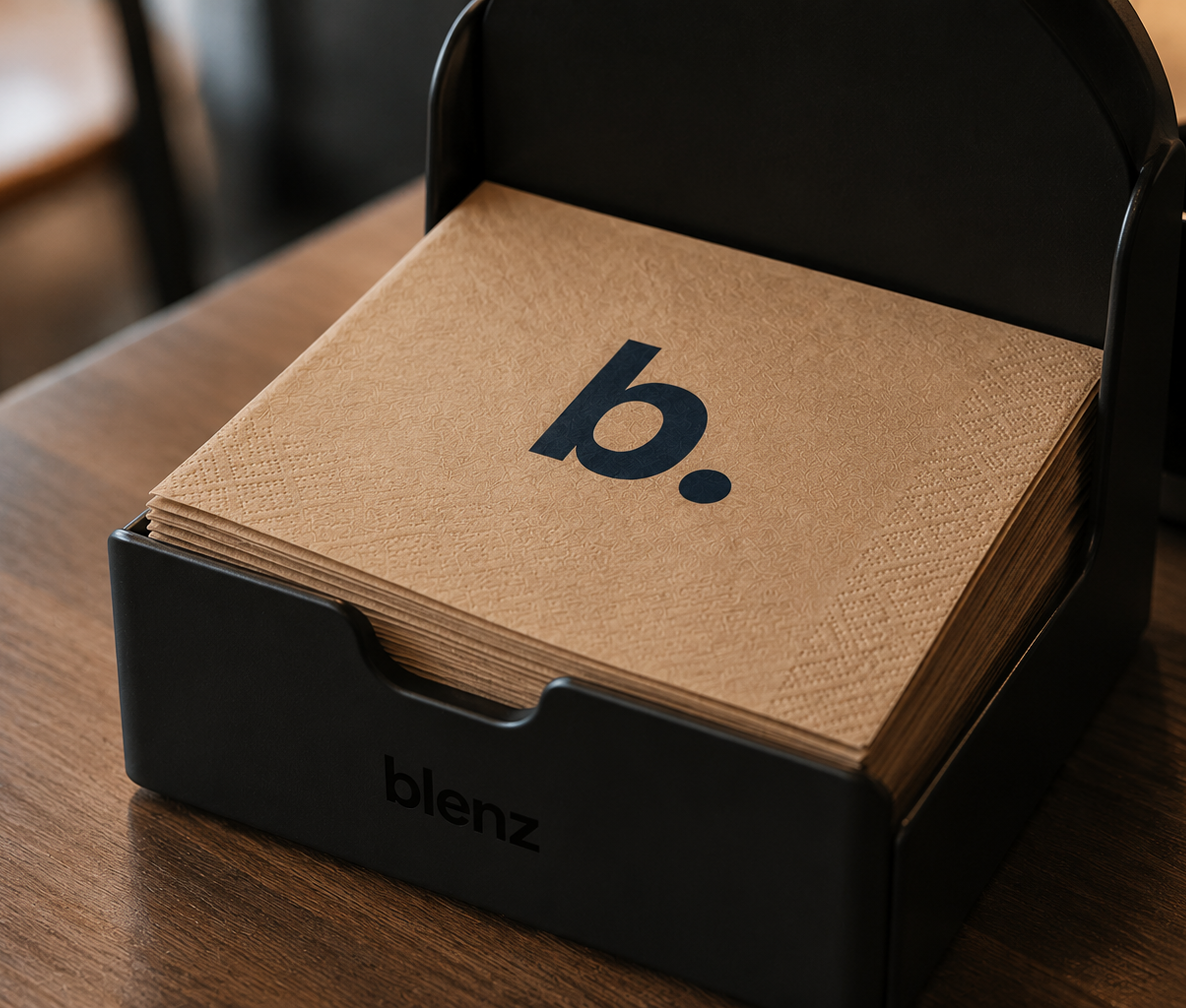
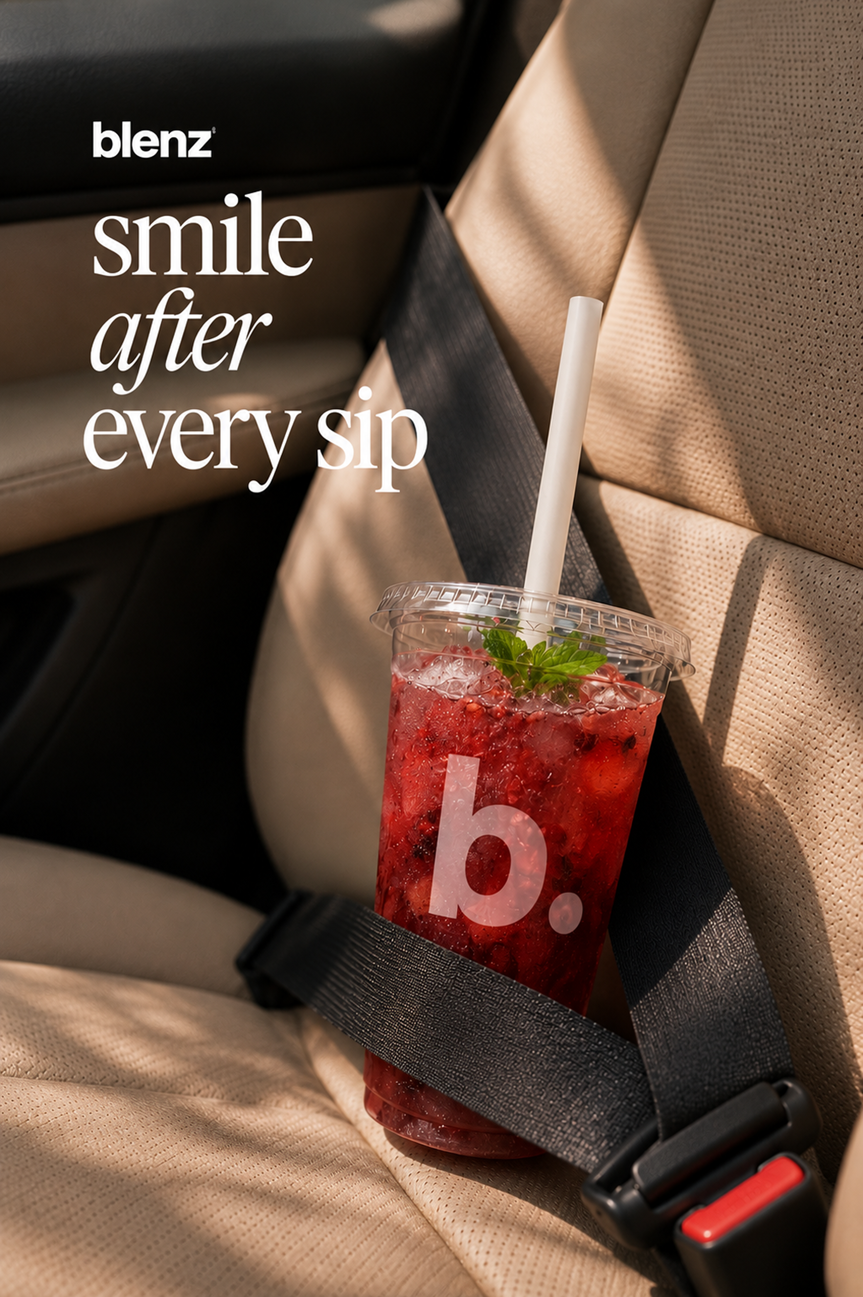
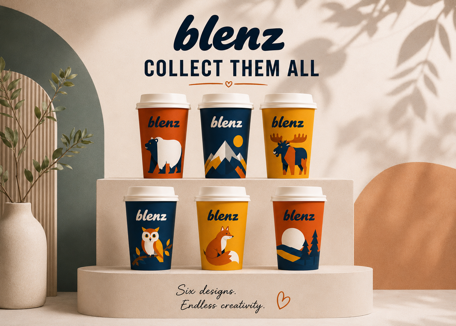
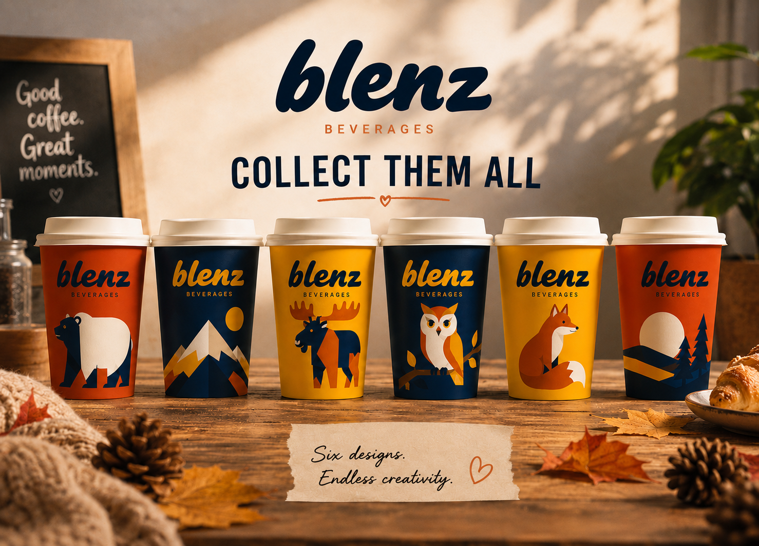
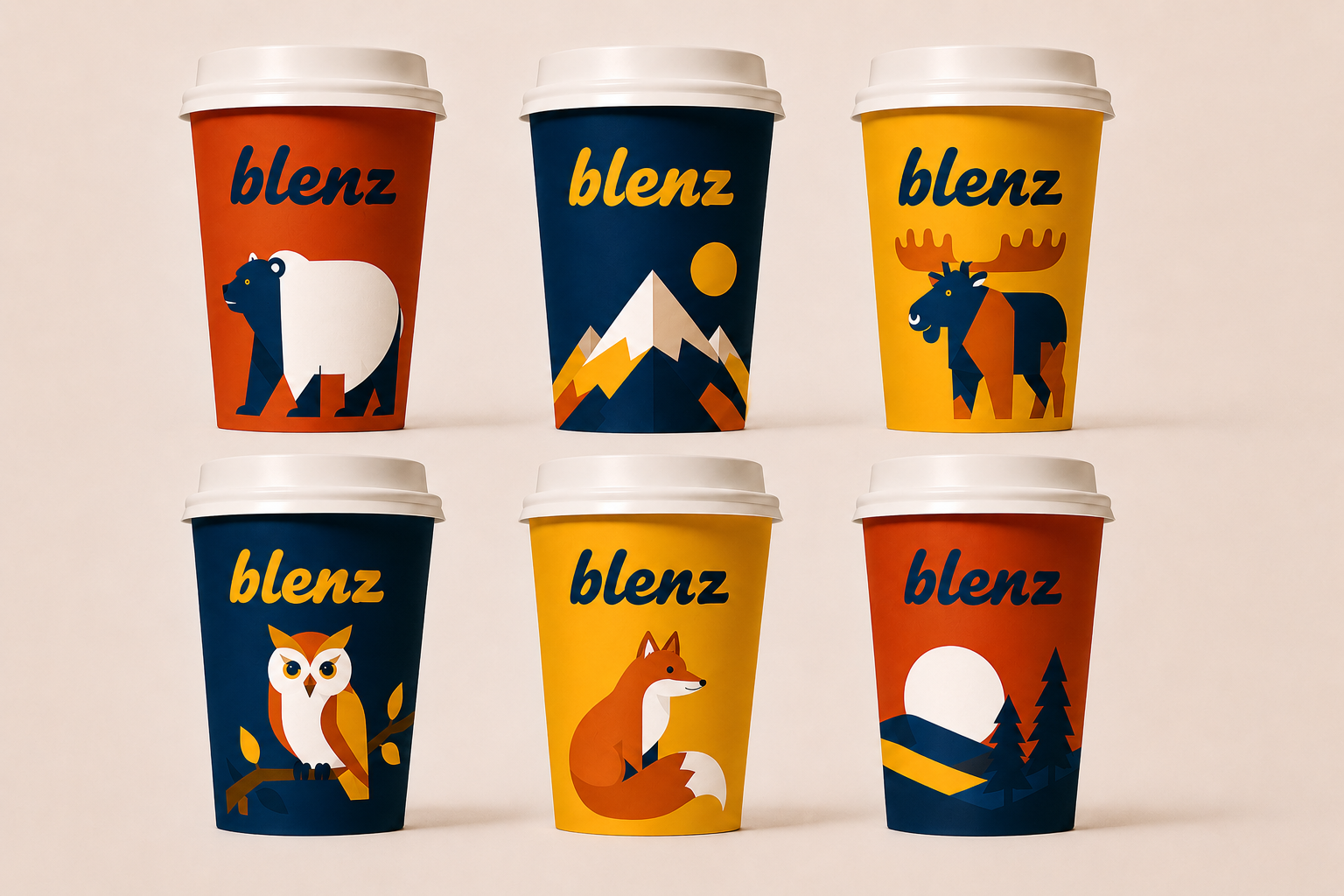
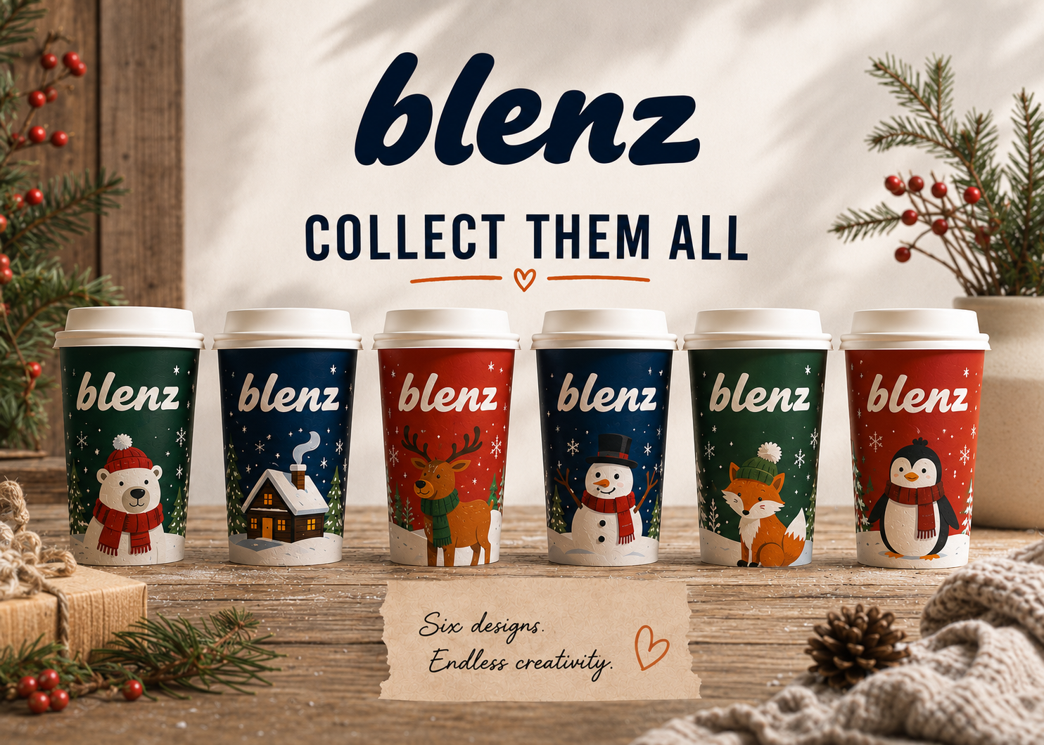
The cup is the thing people carry, photograph and remember. The new b. cup leads with the blue sleeve. Limited drops sit alongside it. Cold cups, pastry bags and napkins carry the same identity all the way through the counter.
Brizas. Powered by our custom syrups. Make it dirty. Float it.
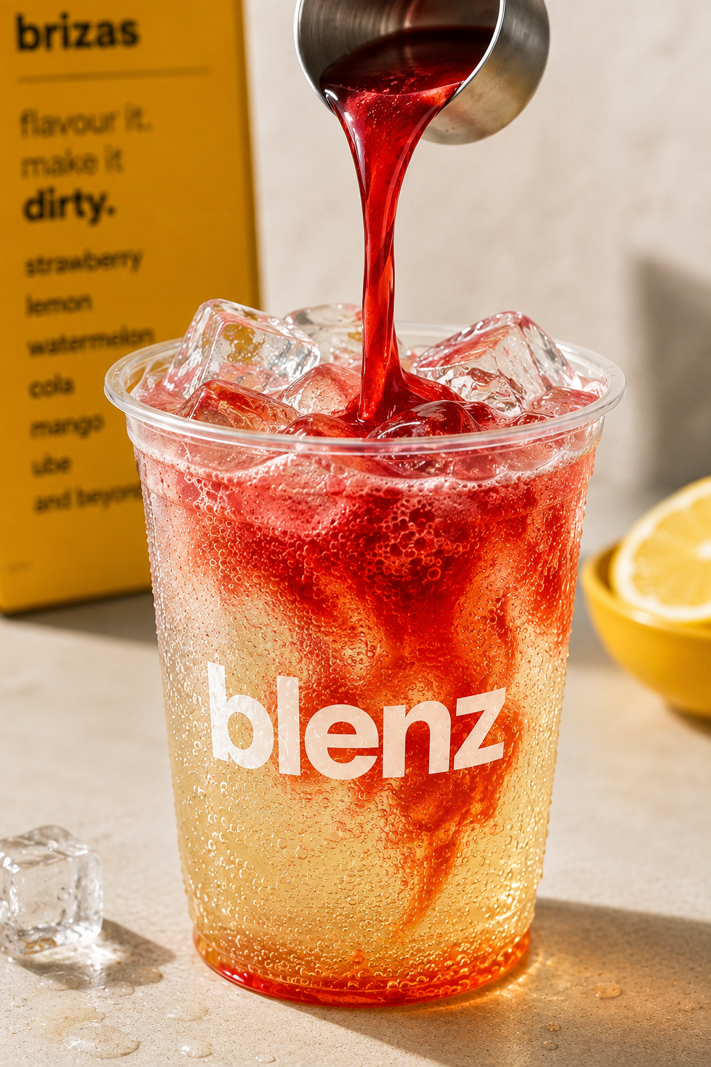 07.1 — Make it dirty
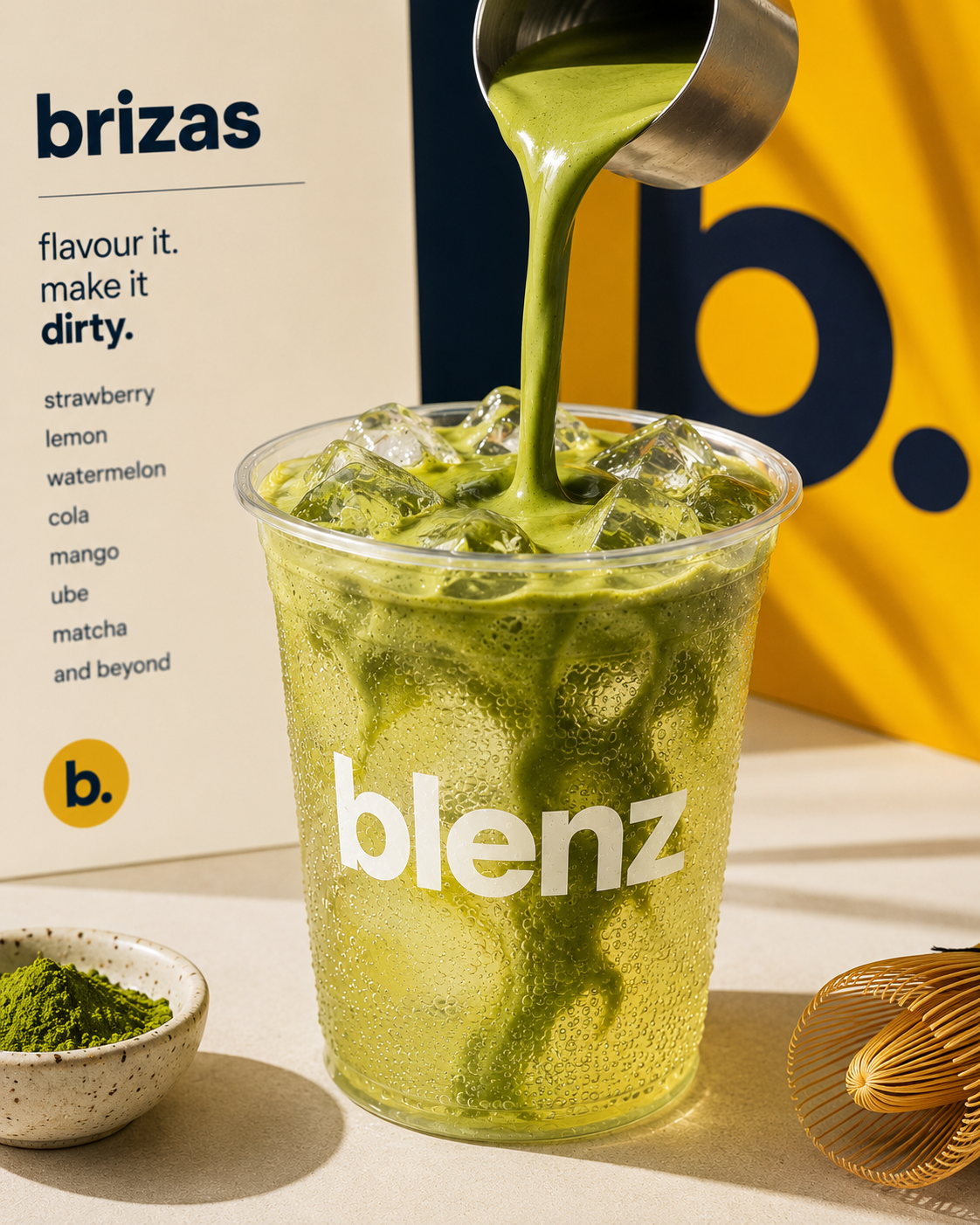 07.3 — Matcha briza
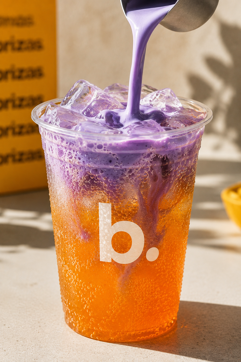
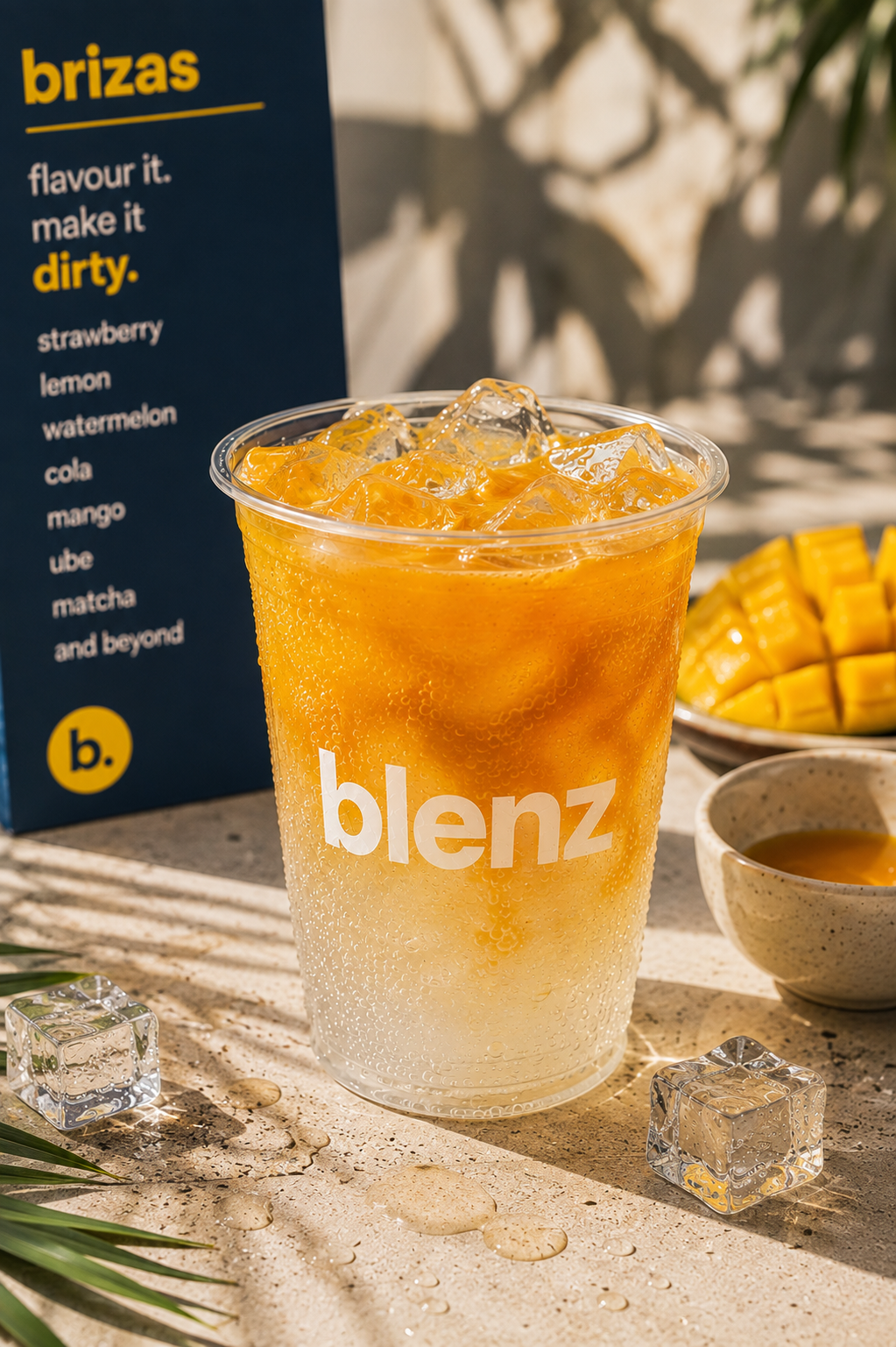
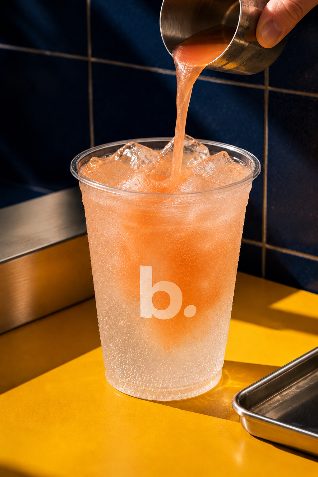
Soft-serve on top of a briza. Every flavour in the range takes a float — strawberry, mango, peach, lemon, tangerine, pandan, kashmiri chai, kola.
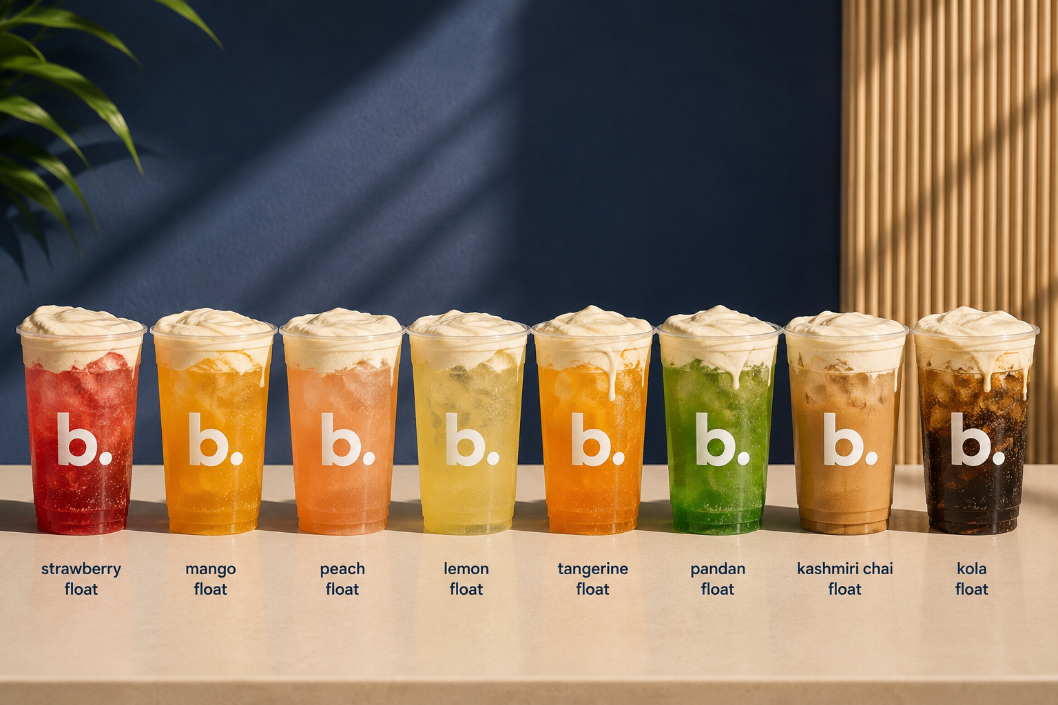 07.5 — The float range
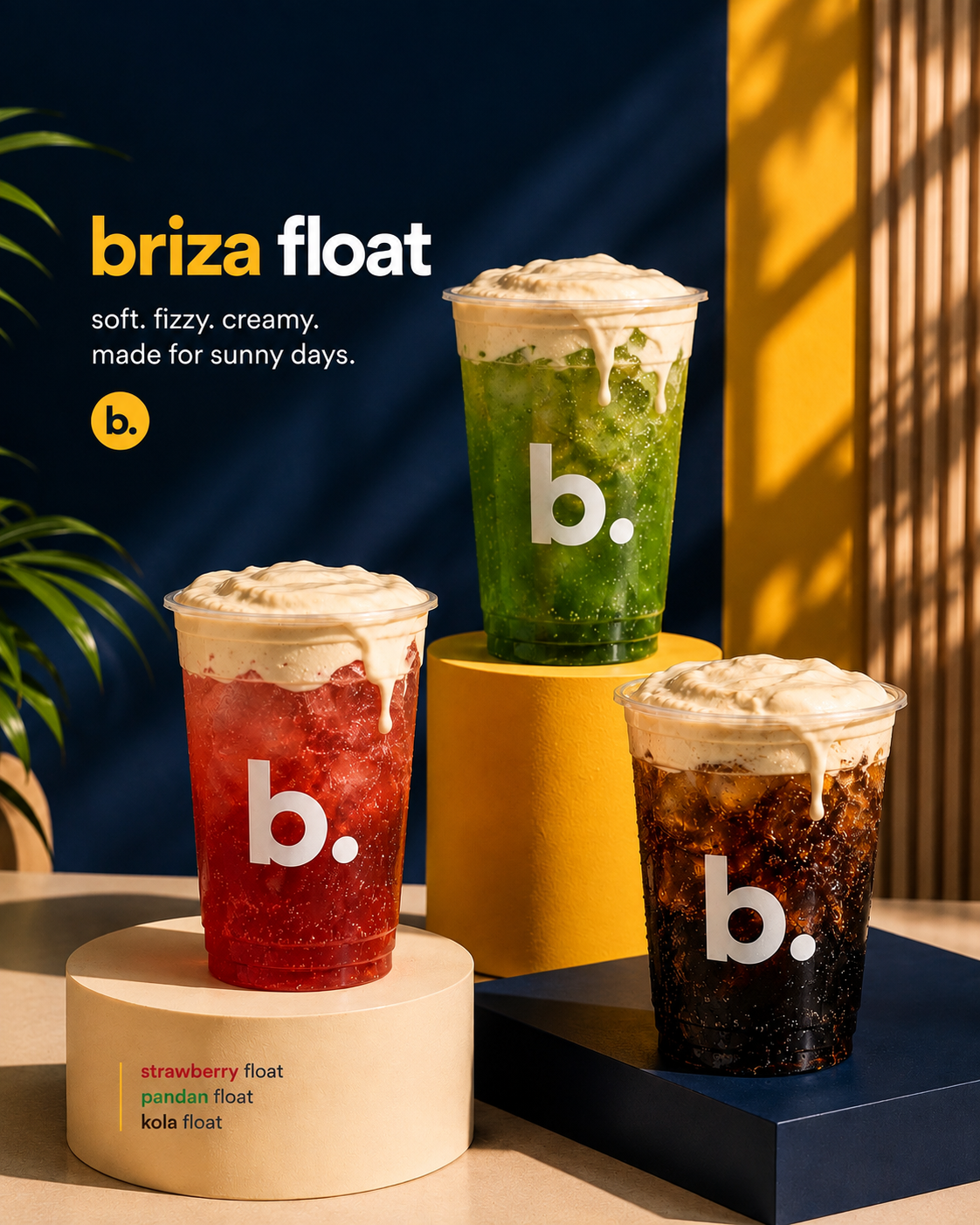 07.6 — Briza float key visual
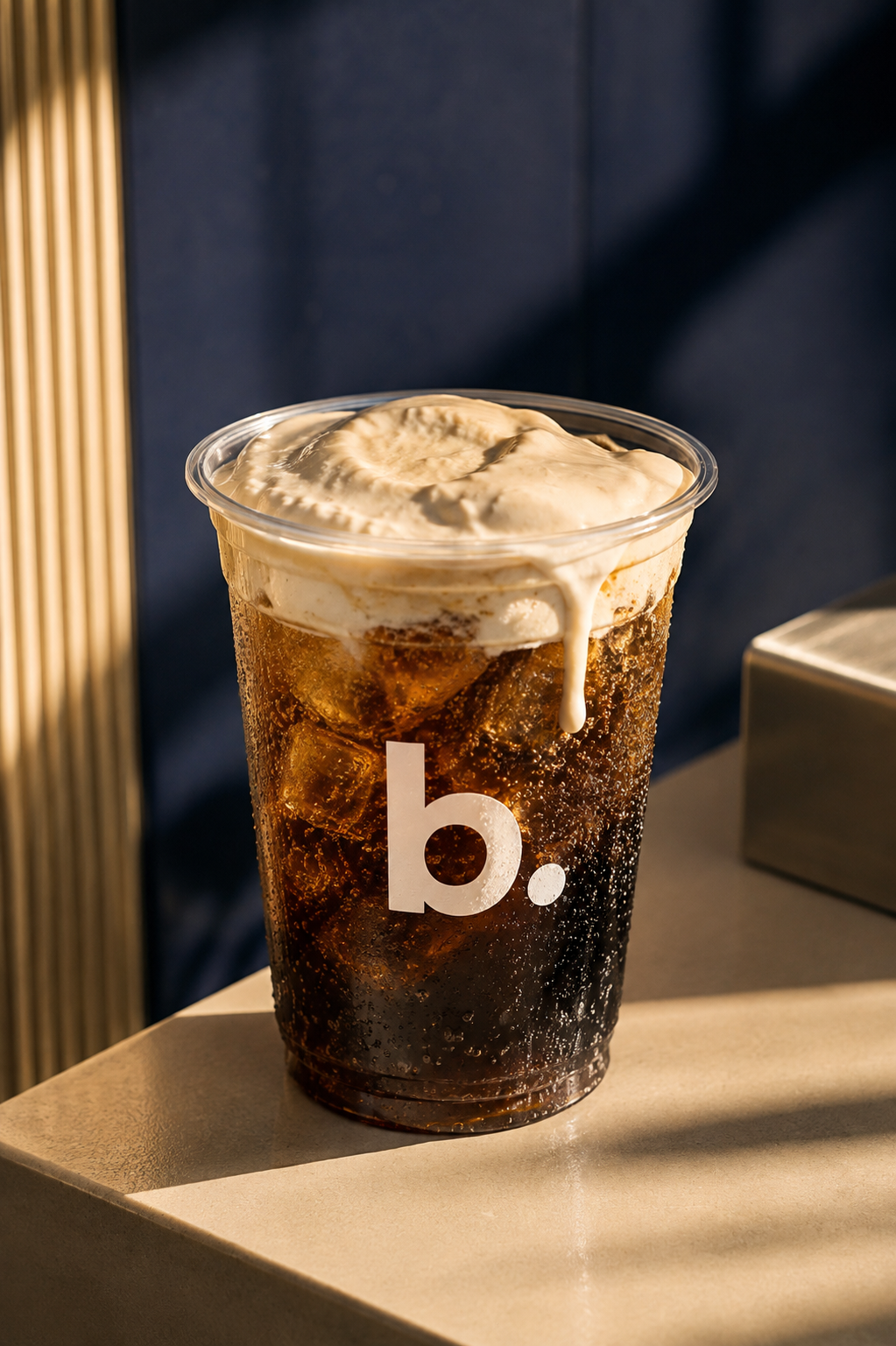 07.7 — Kola float
blenz has entered the syrup space. Strawberry. Cola. Lemon. Make any drink you want. Mix. Match. Strawberry-lemon. Watermelon-ube. The limit is your imagination.
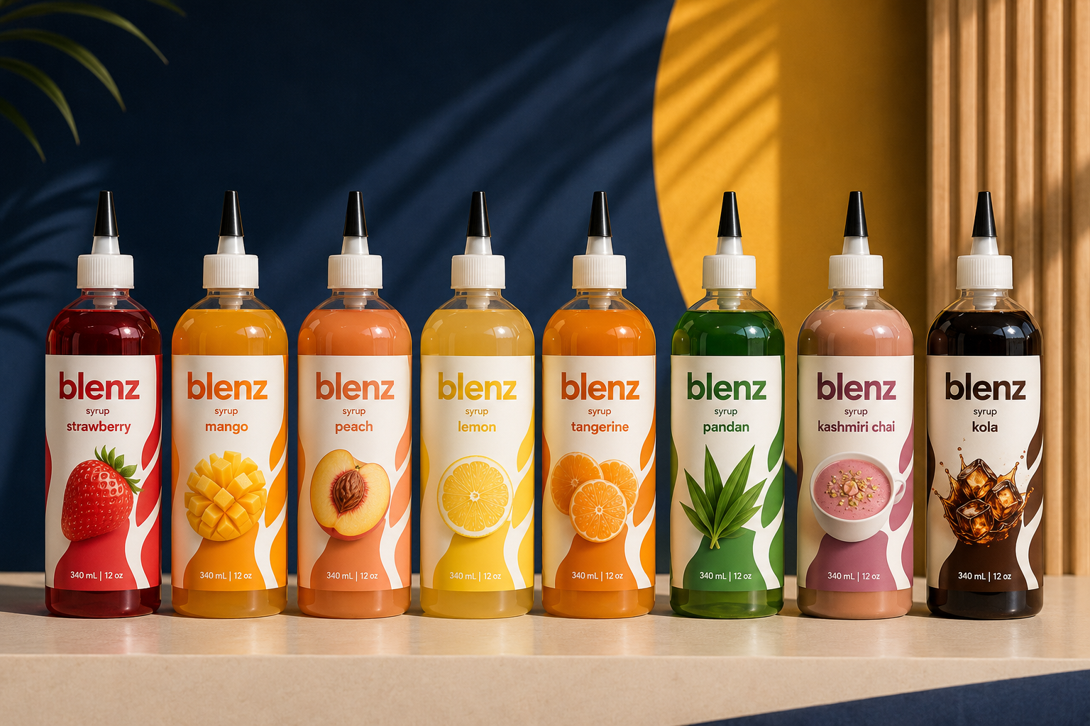 07.9 — The syrup line-up
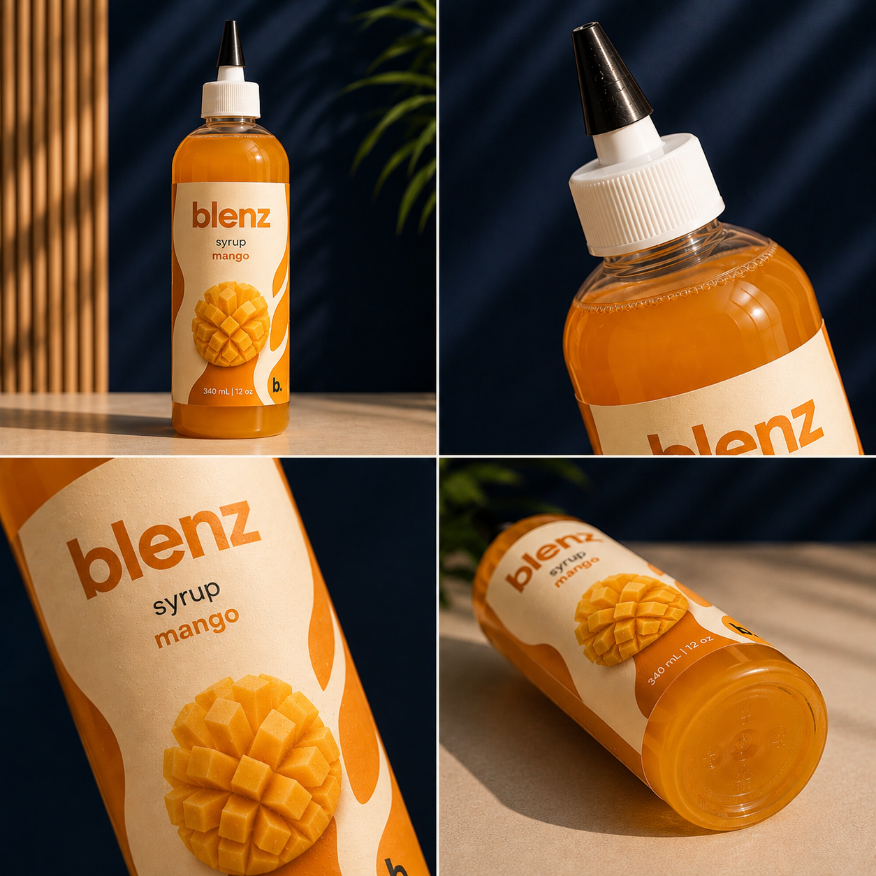 07.10 — Bottle detail
b. is your drink, your way, any way you like. Choose your base — chillos, brizas, iced teas, lattes, matcha — then flavour it to your liking:
All our syrups are custom made by blenz.
Colourways, same structure — one frame. Swipe left and right through the boards, then the full in-store menu system.
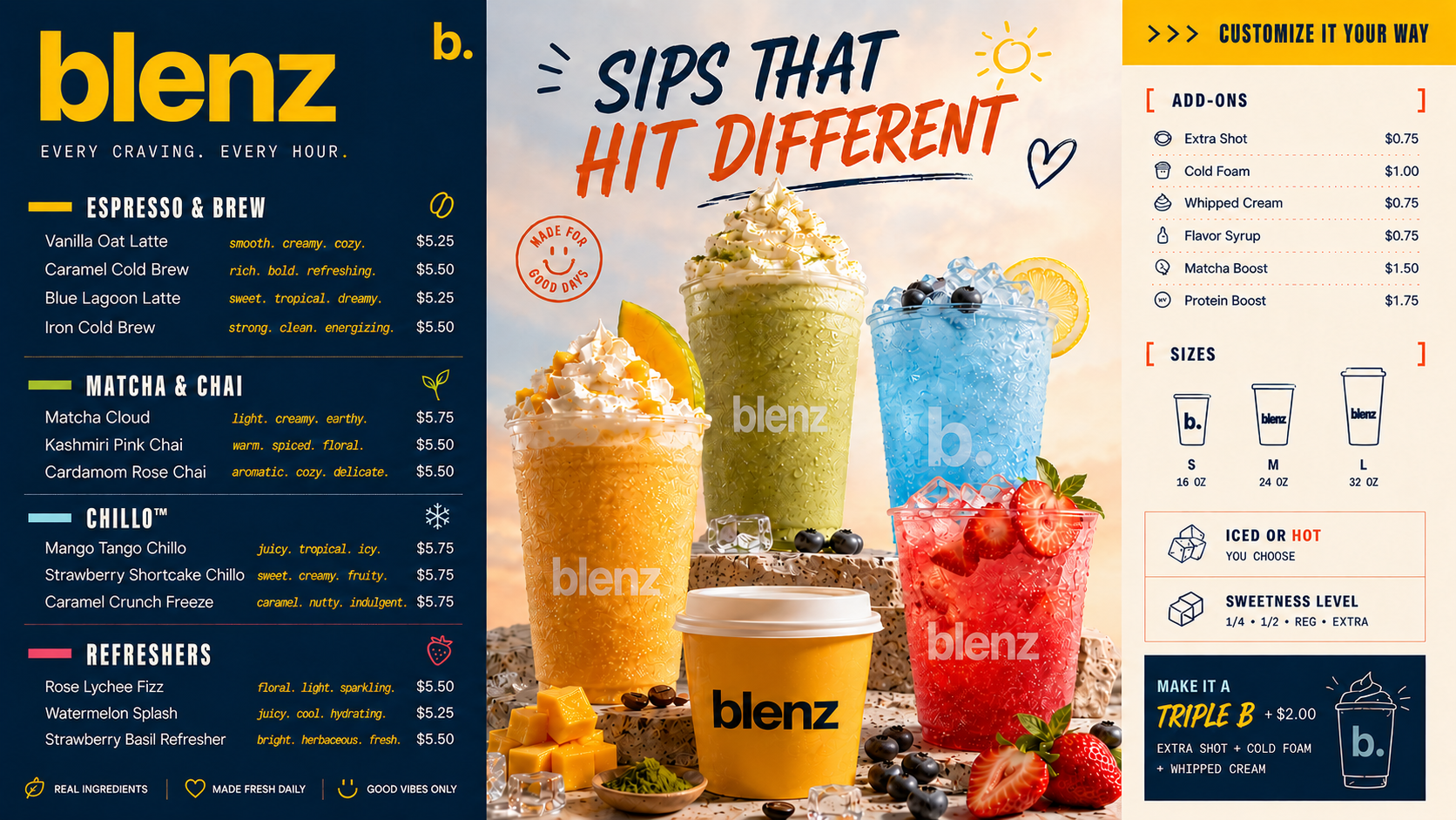 08.1 — Menu board
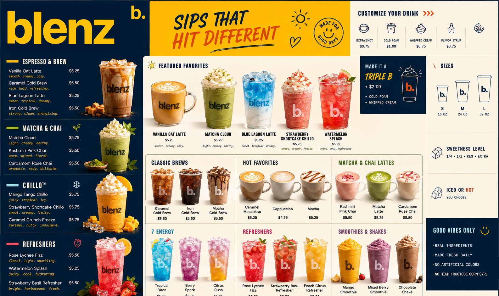 08.2 — Menu board
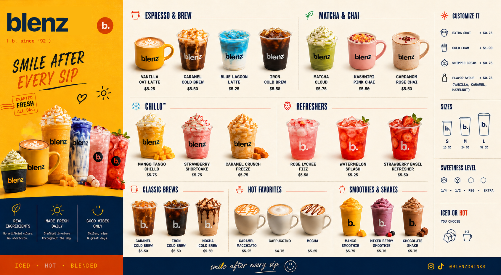 08.3 — Menu board
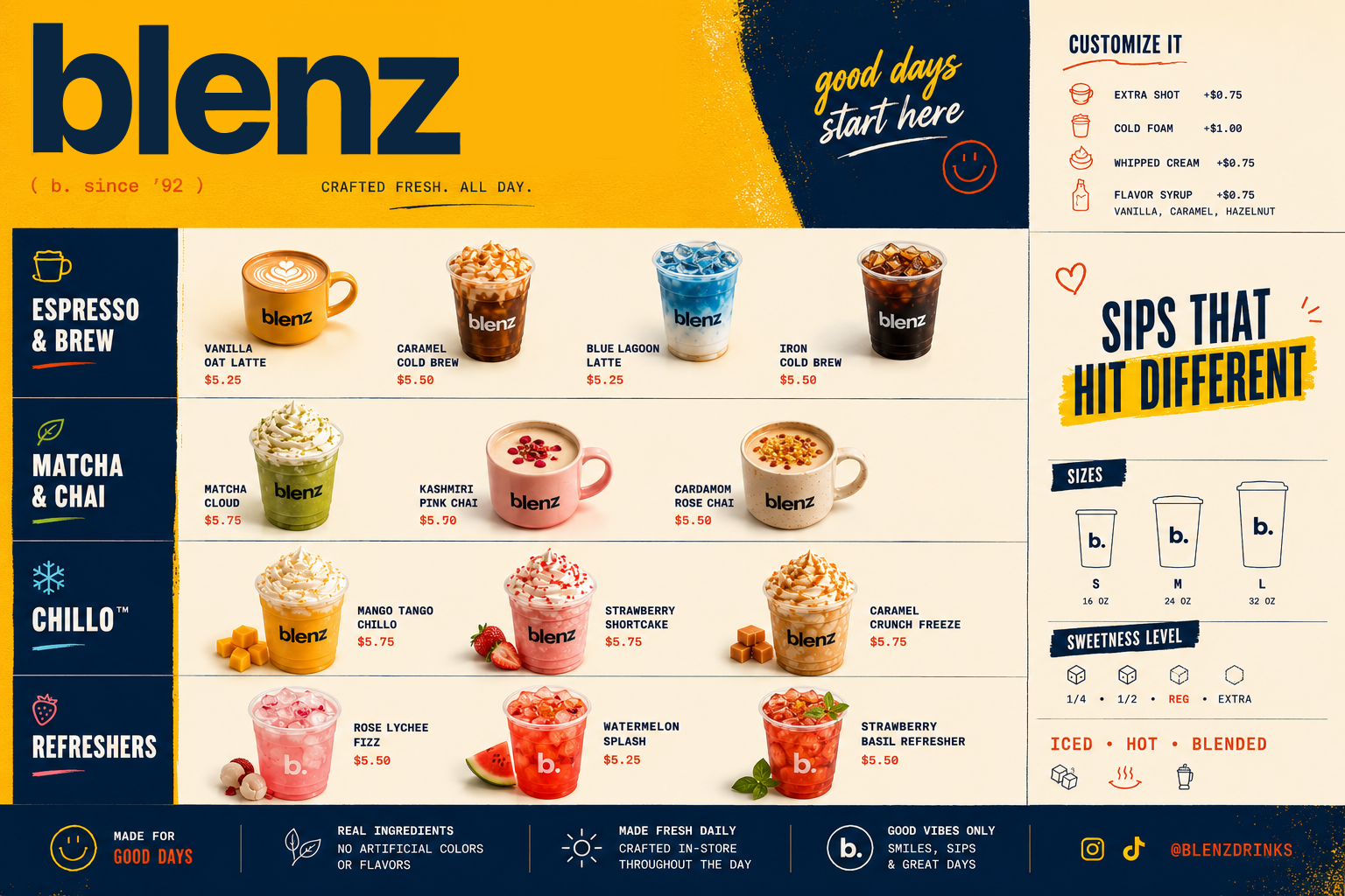 08.4 — Menu board
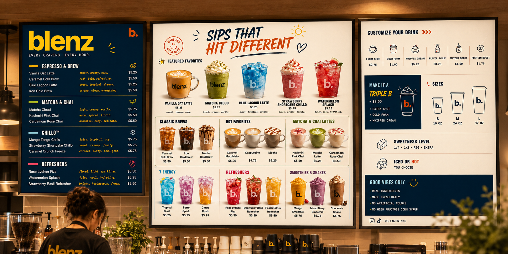 08.5 — Menu board
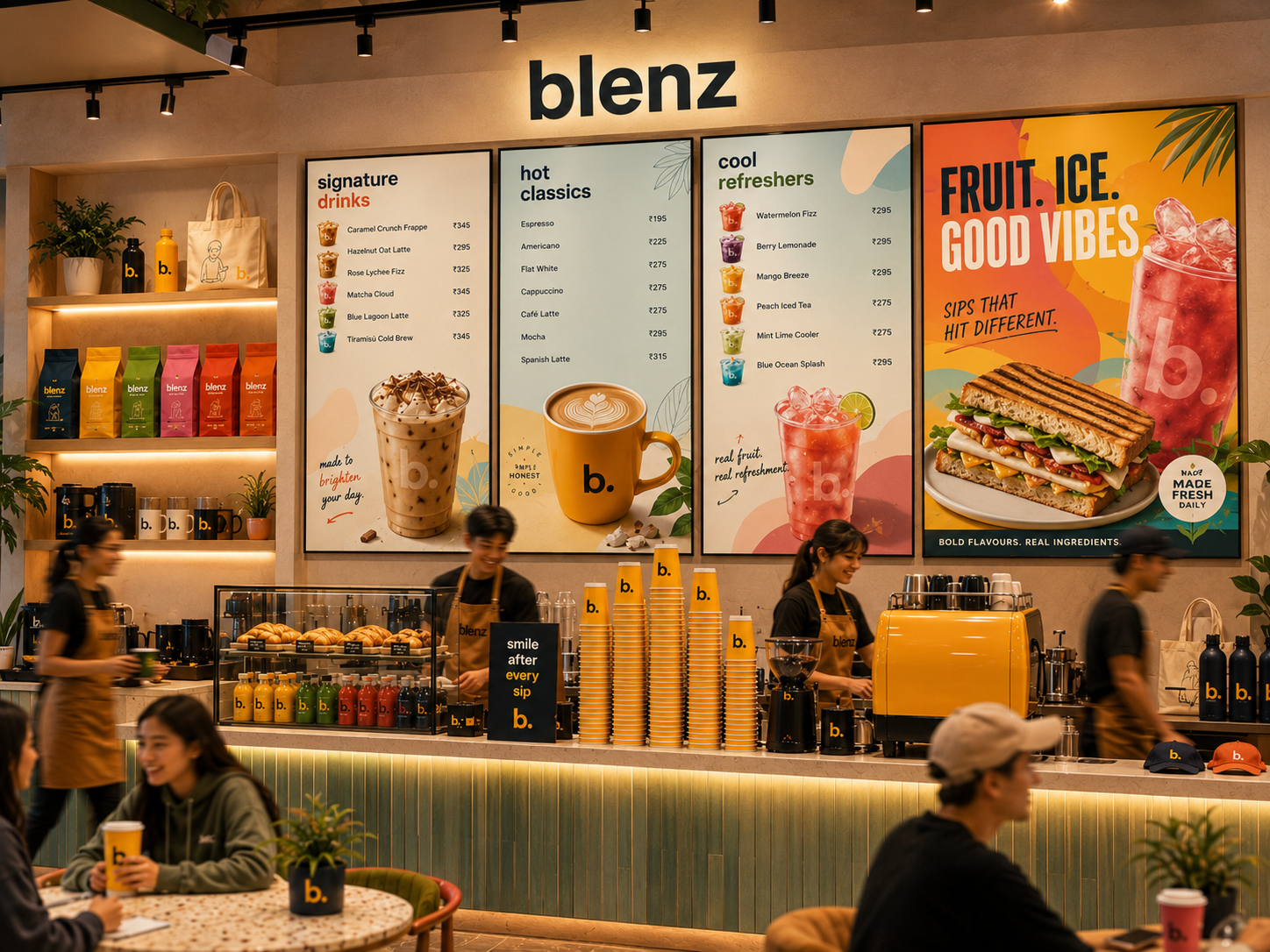 08.6 — In-store menu system
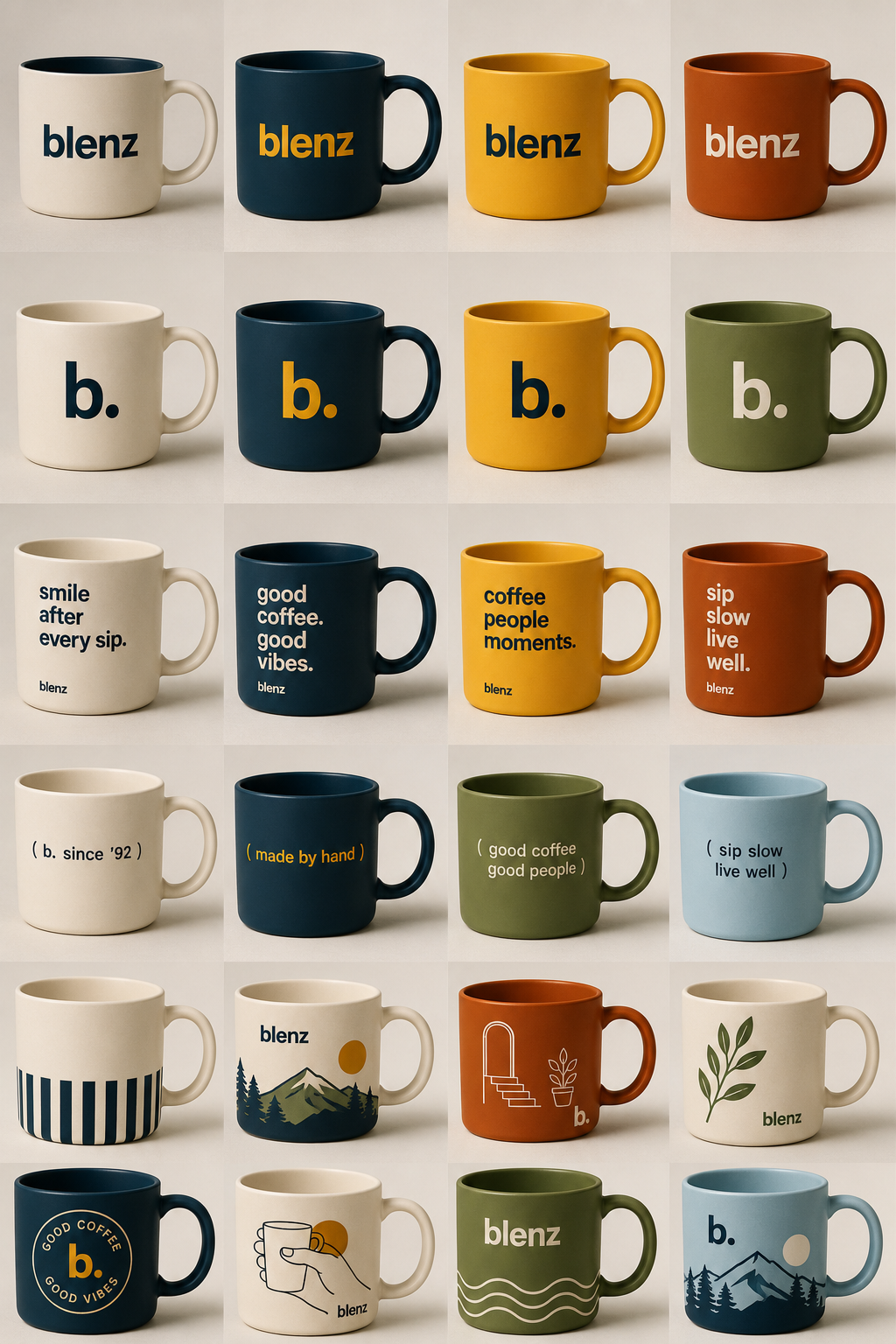
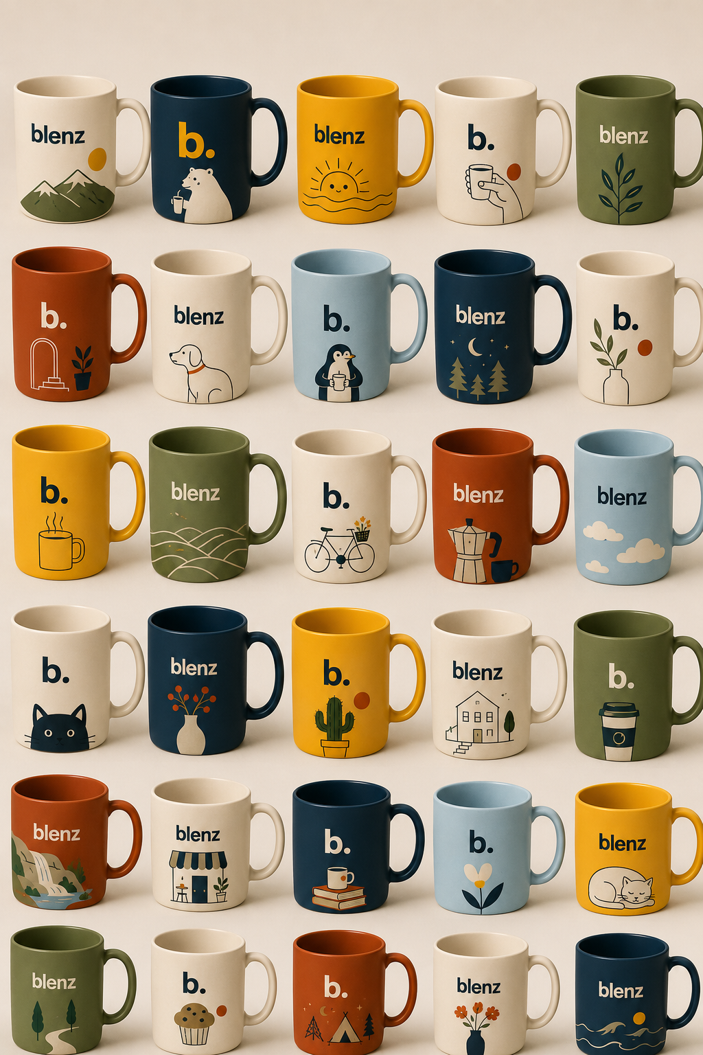
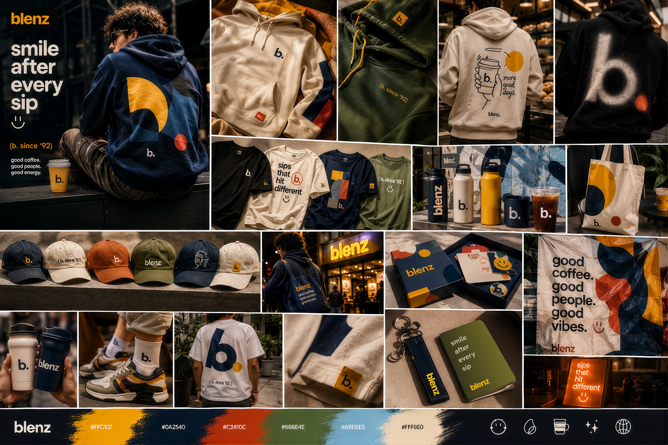
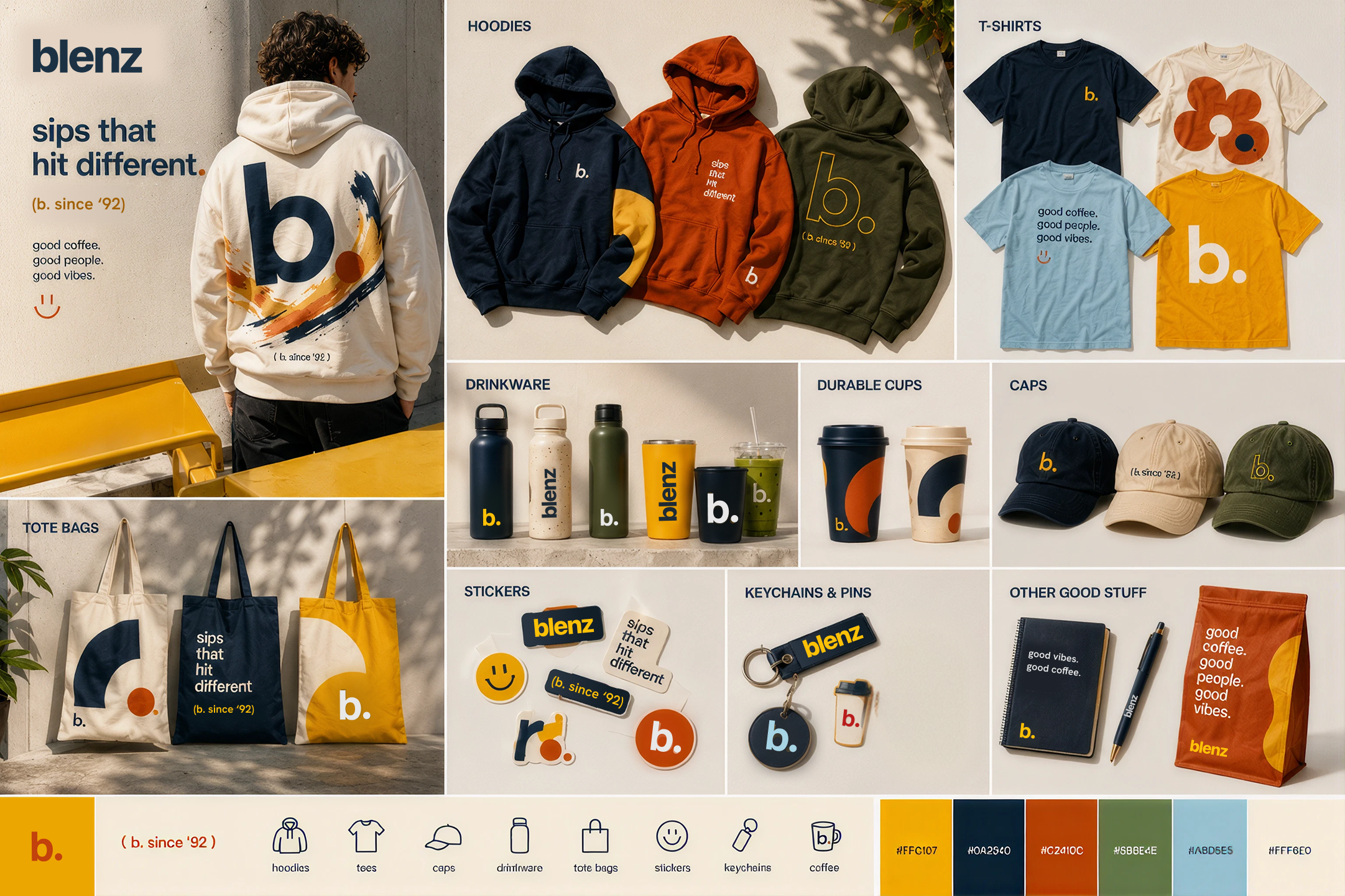
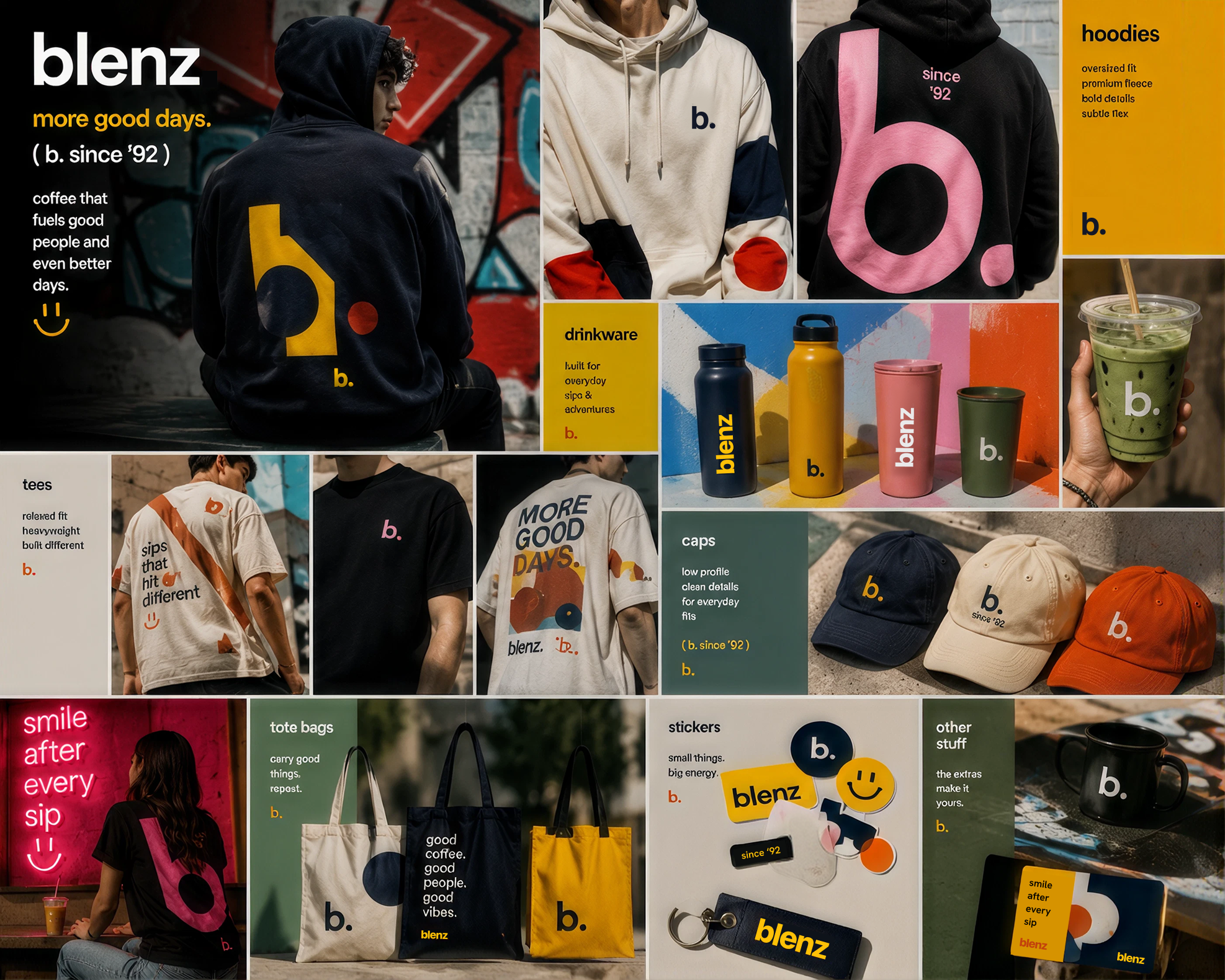
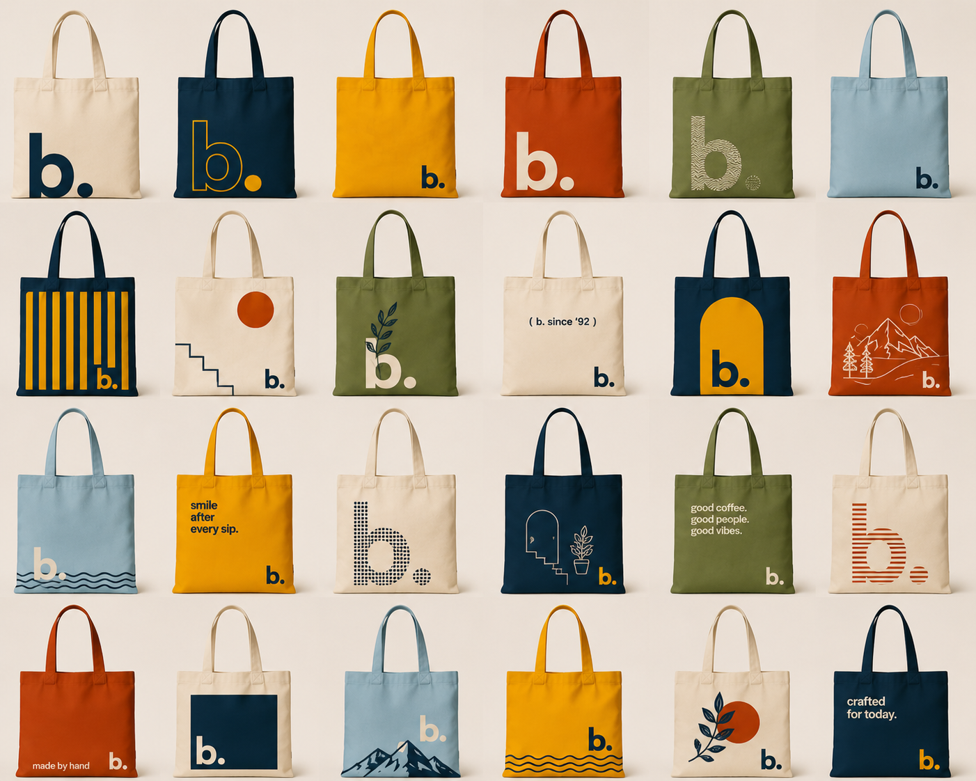
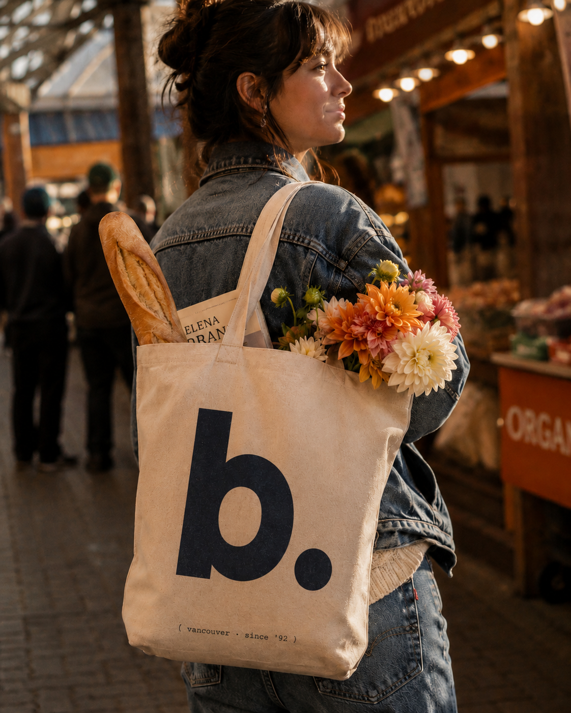
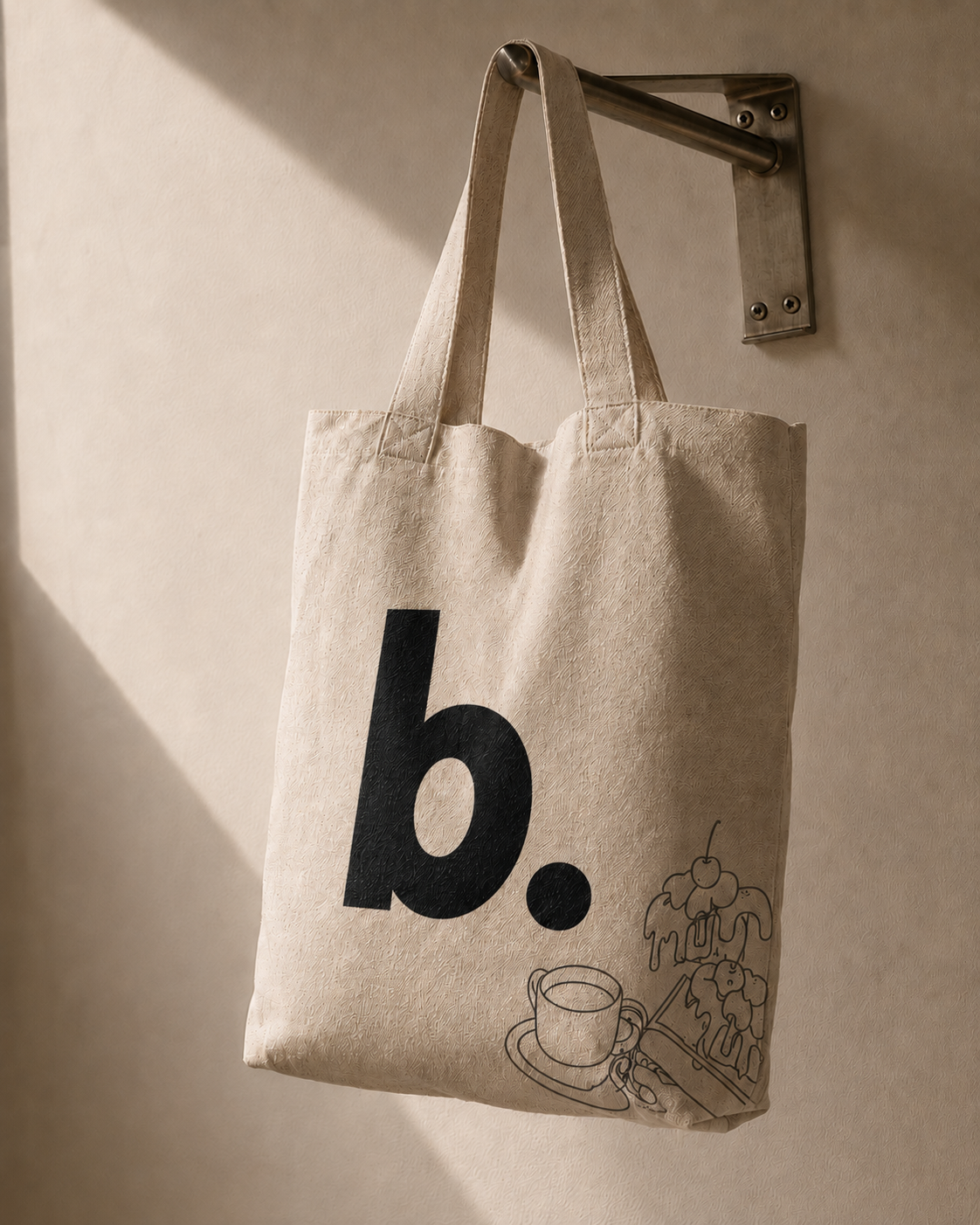
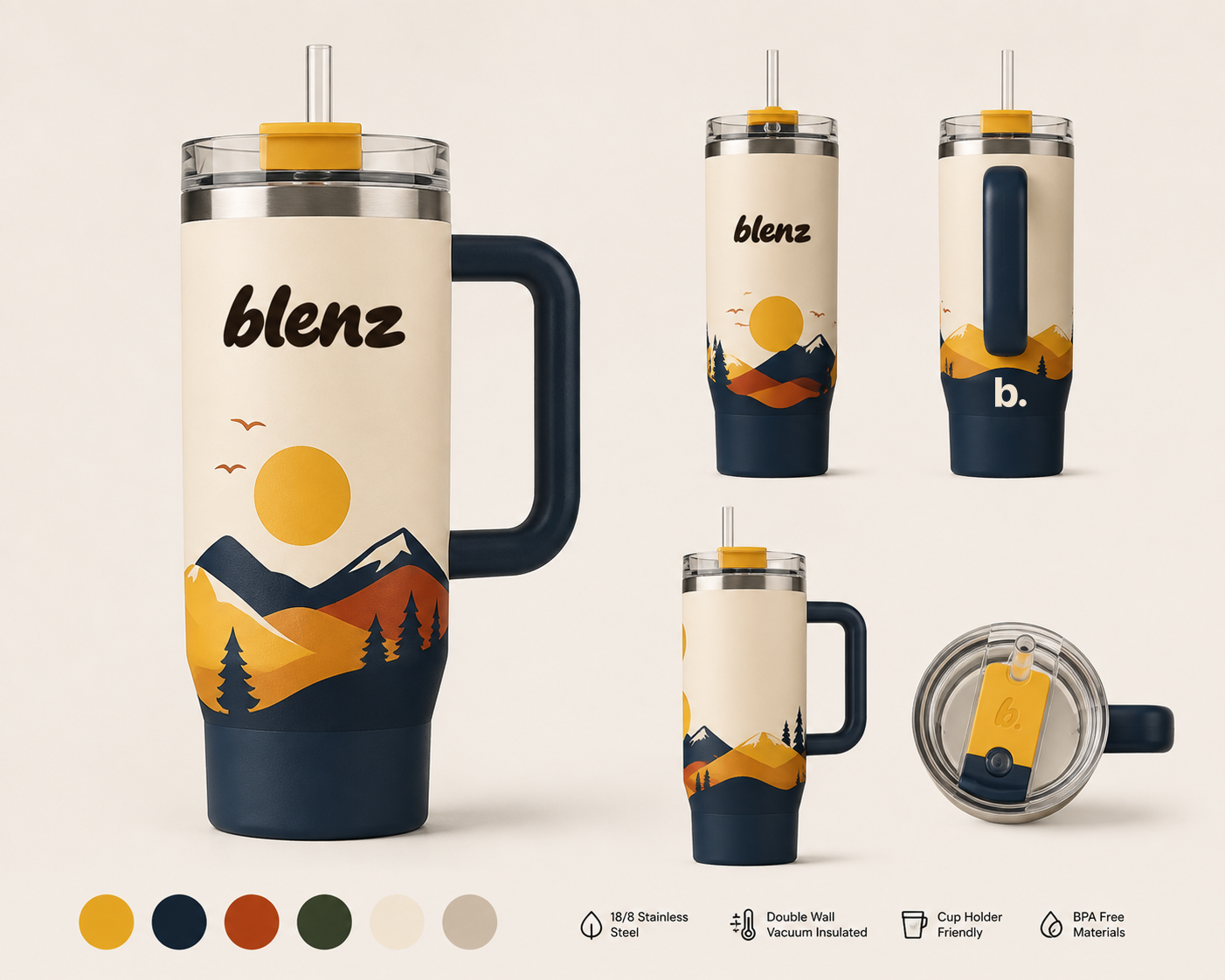
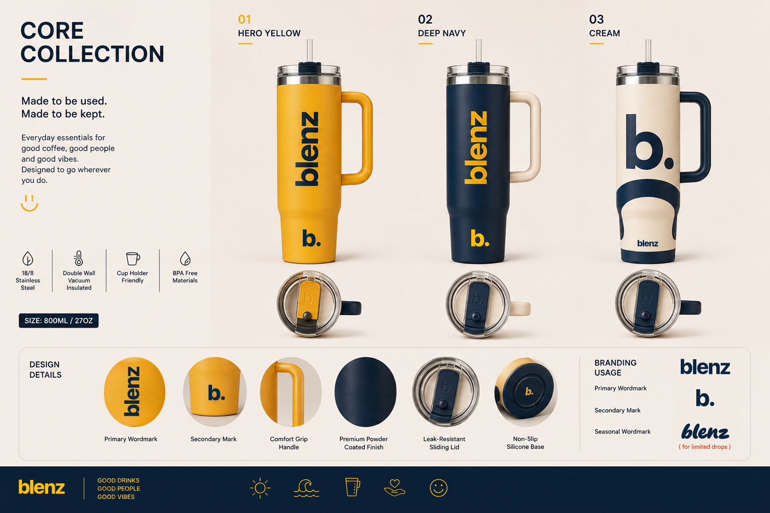
Carefully chosen pieces to start. All made to live in someone’s daily life — not stacked on a counter shelf gathering dust. Sticker-card loyalty replaces the punch card, and the syrups come home with them.
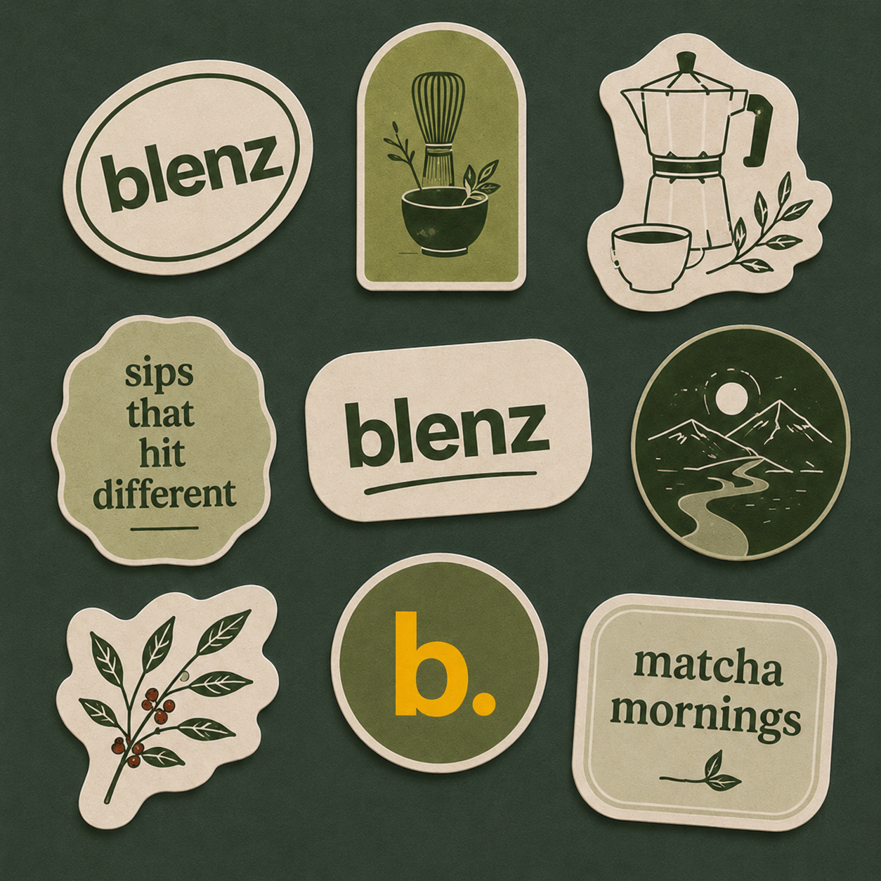
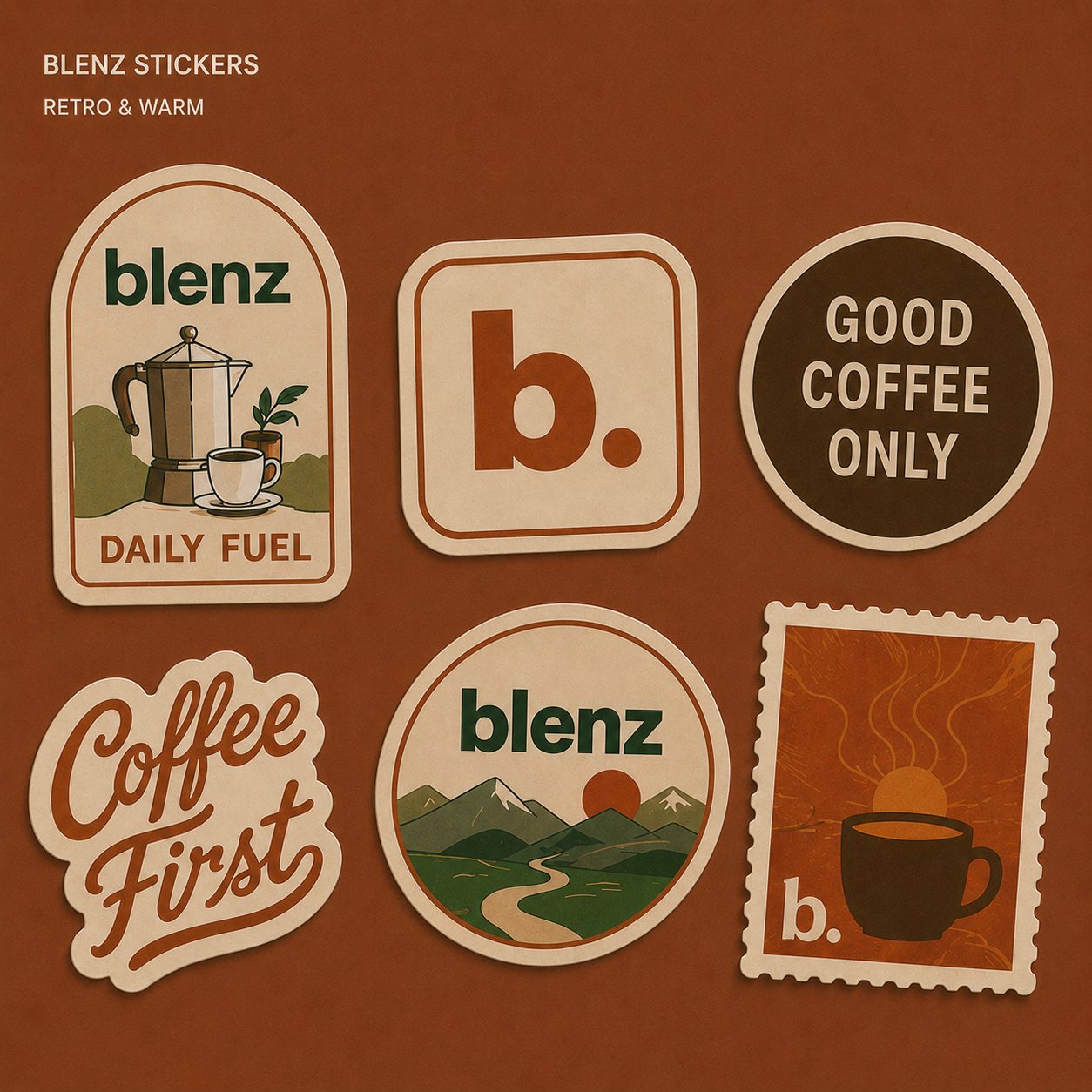
The new blenz culture — still fun, still look-forward. Seven principles for every guest, landlord, and partner.
We are not distant and transactional — we pride ourselves on relationships with our franchisees.
Our goal is long, fruitful relationships. blenz owners are in it for the long haul.
We do drink architects, not baristas. We are constantly innovating. No drink is safe.
blenz is an experience. Every guest that steps through the door is welcomed to be wowed.
We value and respect our franchisees and employees.
We tell it like it is, and help you to understand our why.
Success means action — and we value your feedback.
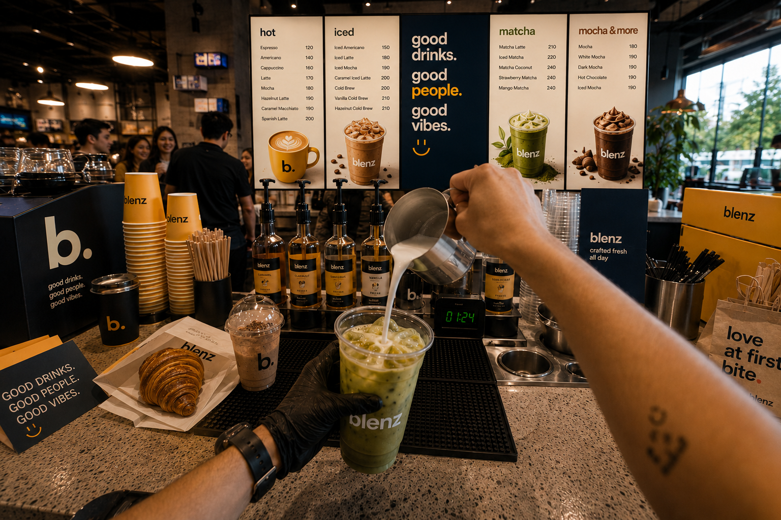 10.1 — Barista POV
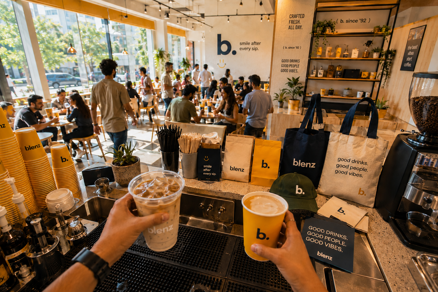 10.2 — Merch at the bar
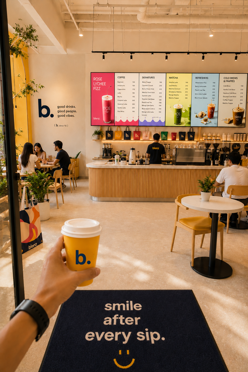 10.3 — Customer POV
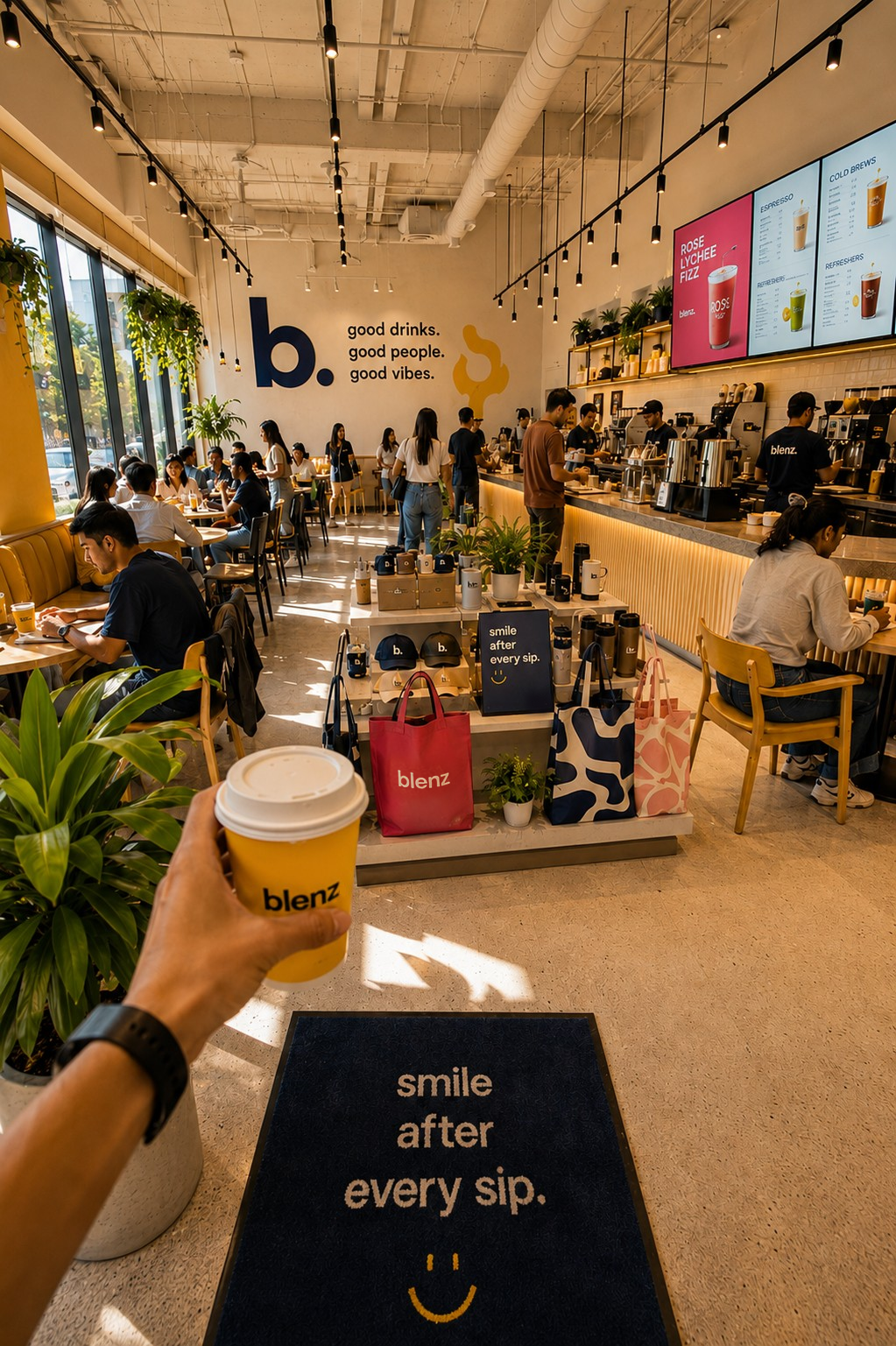 10.4 — Customer POV
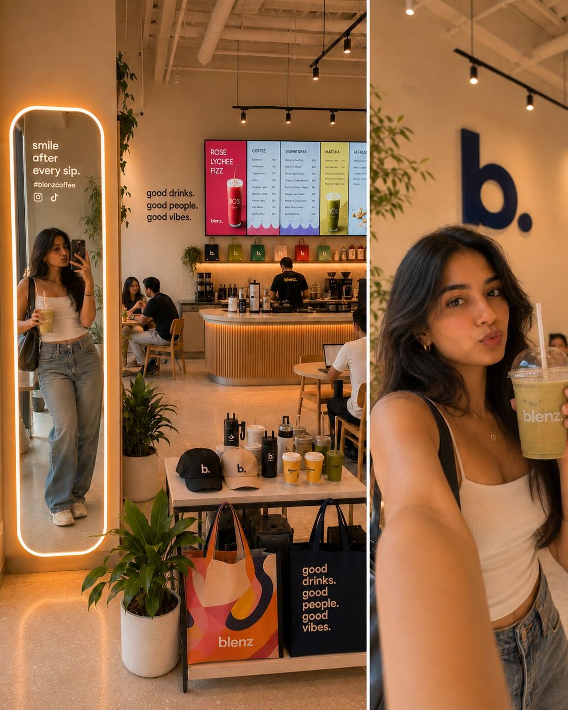 10.5 — UGC POV
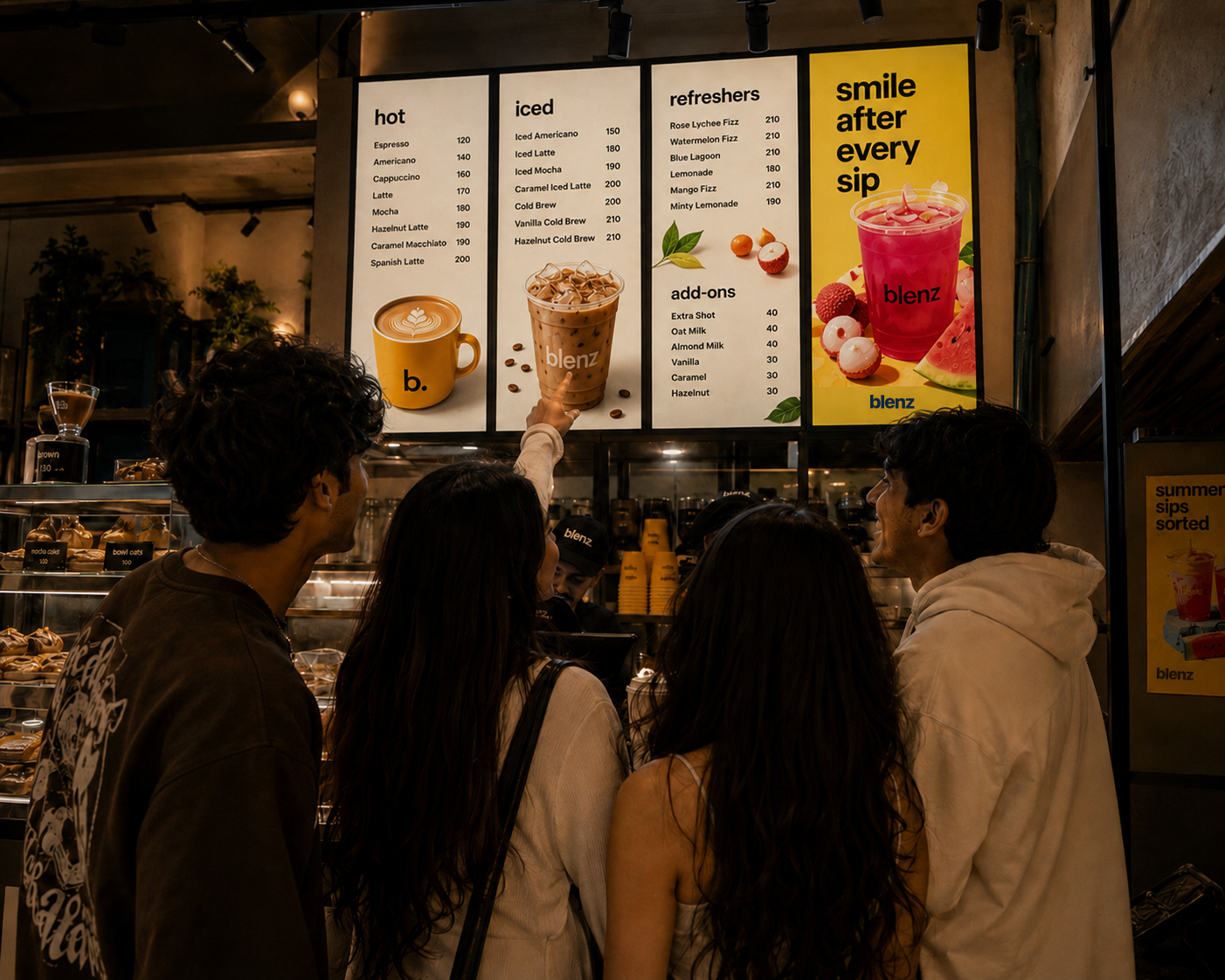 10.6 — Menu · Customer
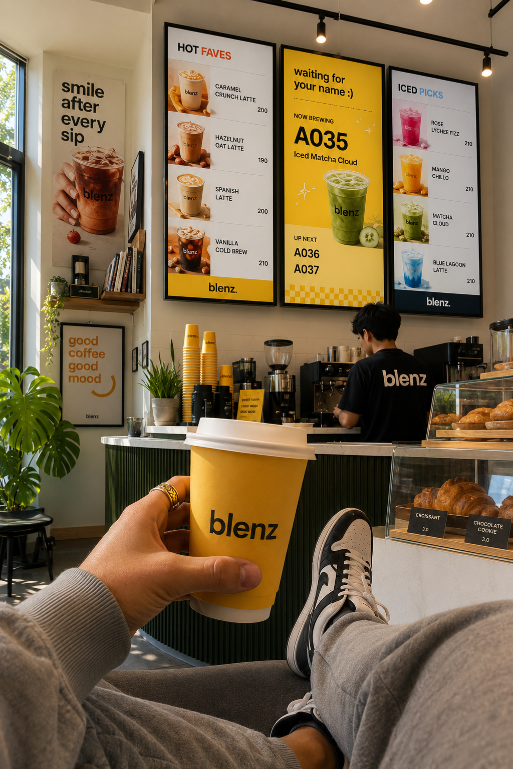 10.7 — Menu · Customer
Heritage in Vancouver. Growth in the cities that are next. Same voice. Same look. New doors.
Store open. The brand travels with the same lowercase confidence.
Global expansion underway. Visuals and market notes land here next.
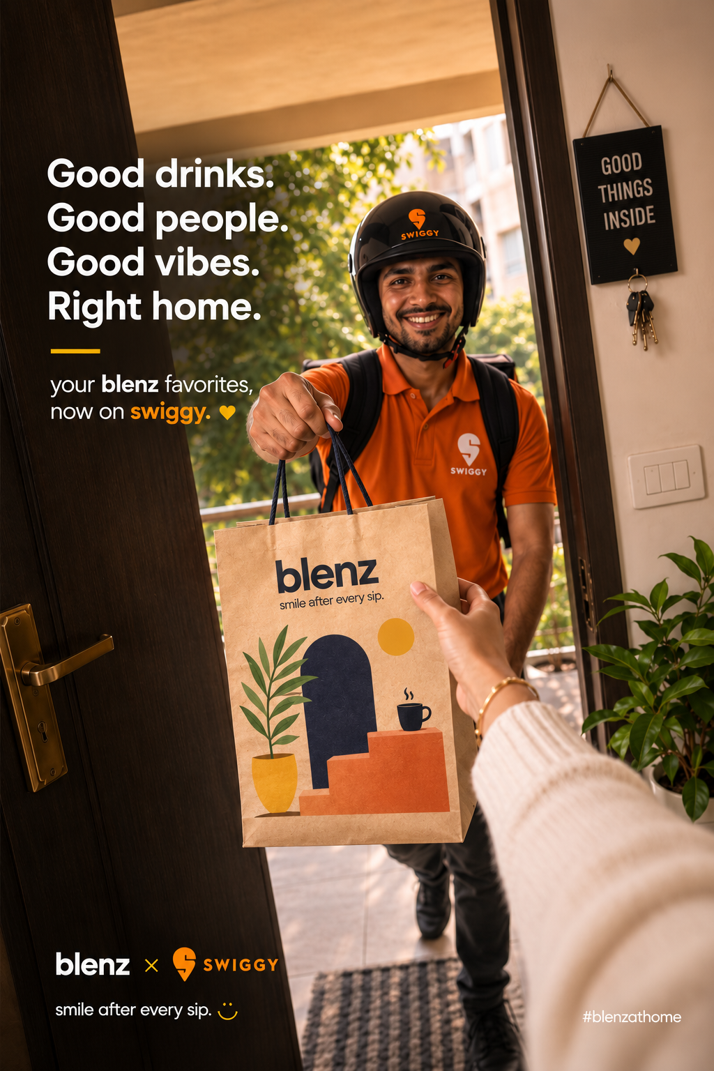 11.1
— India · Delivery POV
11.1
— India · Delivery POV
In India, the first blenz moment often happens at home — not in store. Swiggy and Zomato are the front door, so the bag, the sleeve and the sticker card have to carry the whole brand on their own.
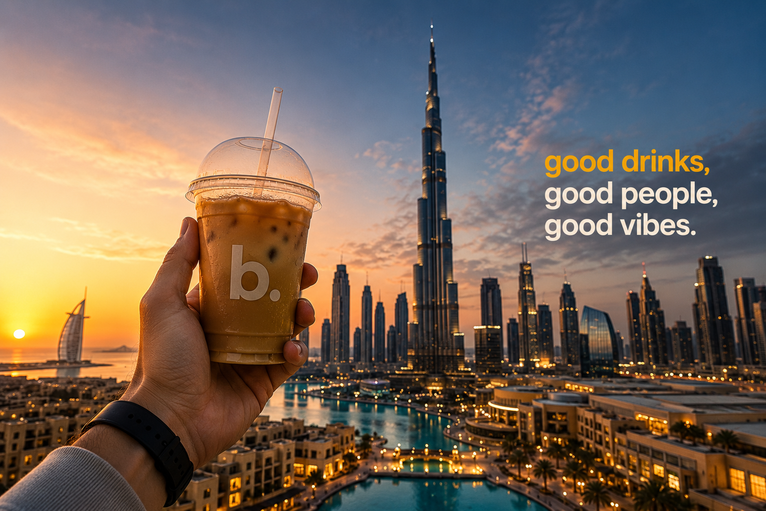 Dubai · Opening
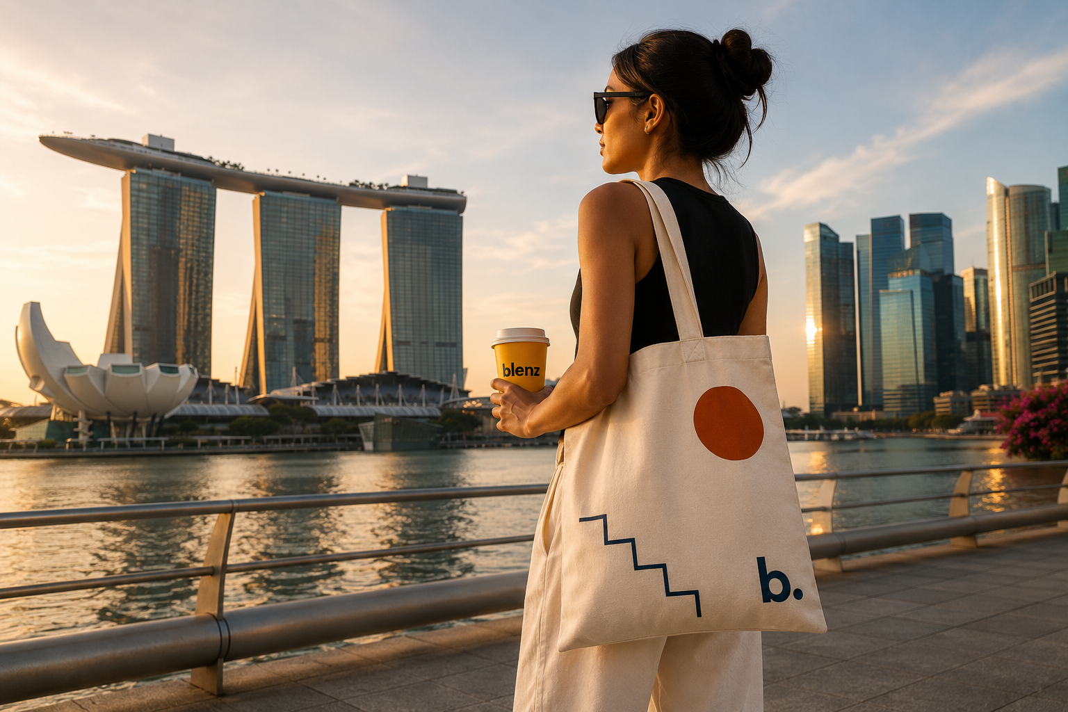 Singapore · Opening
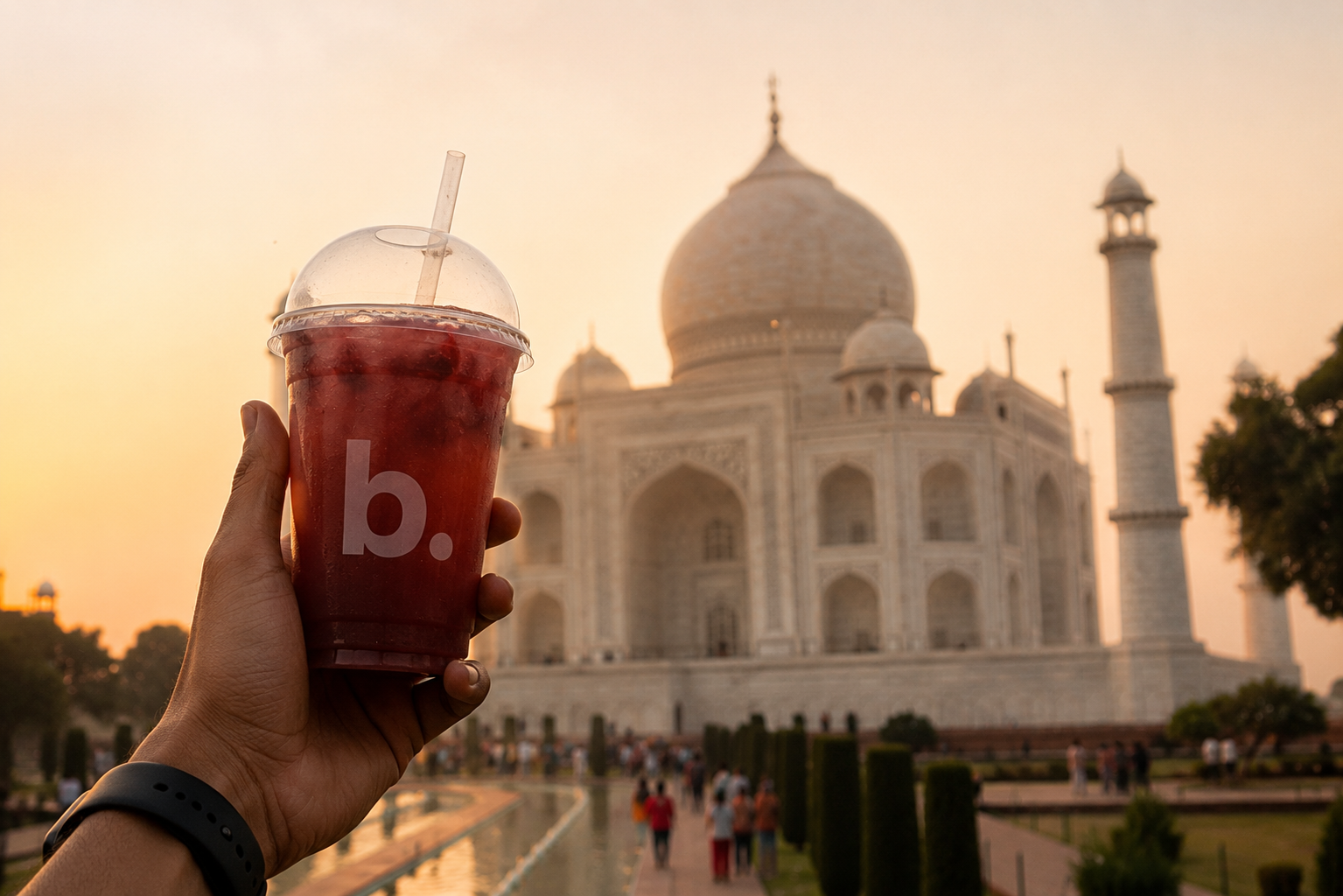 India · Taj Mahal
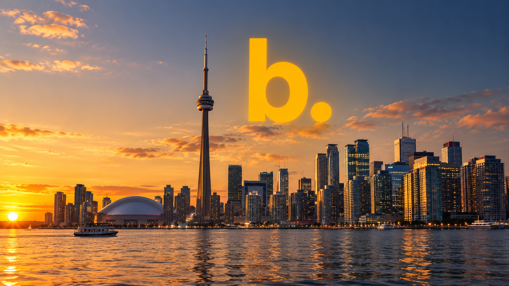 Toronto · Open
Width steals from the neighbour in the same row, so the row total stays put. Drag the yellow handles on the page for the same thing.
Drag the image on the page to move it, scroll-wheel to zoom.